Cueball Category wise Portfolio
Access premium designs crafted by the top 2% of creative talent
dedicated to client-focused excellence.

Turn ideas like this into your next project

Intro
Vedhaa’s Silks needed an identity capable of carrying the visual richness of silk without becoming ornamental for ornament's sake. In a category filled with traditional motifs, decorative typography and familiar cultural symbols, the challenge was to build a brand presence that felt rooted in heritage yet immediately ownable.
The identity needed to hold its elegance across saree packaging, textile labels, shopping bags, storefront communication and digital platforms. The central challenge was clear: translate the movement, prestige and ceremonial beauty associated with silk into a strong visual signature that customers could recognise before reading the name.
The result is a brand system where the peacock becomes more than decoration—it becomes the visual embodiment of silk itself.
Brand Brief
Personality
Regal, graceful, expressive, traditional, feminine and refined.
Vedhaa’s Silks carries the confidence of ceremonial luxury while remaining emotionally connected to the beauty of Indian textile culture.
Vision of the Business
To build a distinctive silk brand where every customer touchpoint celebrates the elegance, movement and cultural significance of traditional draping.
Target Audience
Women and families seeking silk sarees and traditional garments for weddings, celebrations, ceremonies and meaningful occasions.
The identity particularly speaks to customers who value cultural beauty, visual richness and a premium presentation experience.
USP
Silk elegance expressed through a distinctive peacock-led brand experience.
Logo Type
The identity combines a self-contained peacock emblem with an elegant serif wordmark. This structure gives Vedhaa’s Silks both visual recognition and name clarity.
The emblem can independently appear on labels, packaging seals and social media, while the complete lockup creates a formal and established retail presence.
Tagline
Grace in Every Drape
Key USPs
1. Occasion-Led Elegance
The brand is positioned around meaningful moments where silk becomes part of celebration, memory and personal expression.
2. A Distinctive Silk Signature
The peacock-inspired identity creates a recognisable visual language that separates Vedhaa’s Silks from conventional textile branding.
3. Tradition with Premium Presence
Cultural cues are presented through controlled composition, rich colour and refined detailing, giving traditional silk a more elevated brand experience.
The Vision
The creative vision was to make silk visible before it was touched.
The identity needed to communicate softness, movement and ceremonial grandeur while creating the confidence expected from a premium textile brand. Rather than illustrating a saree directly, the visual direction translates the natural flow of fabric into the layered feathers of a peacock.
Gold brings richness. Deep red brings celebration. The serif typography creates poise and heritage.
Every element works toward one central idea: to turn the grace of silk into a visual signature.

Usage Guide
Clear Space
The minimum clear space around the Vedhaa’s Silks logo is defined as X, where X equals the width of the gold outer border of the peacock emblem multiplied by four.
A minimum distance of 1X should be maintained on every side of the complete logo lockup.
No text, graphics, images or other visual elements should enter this protected area.
For the case study, isolate the border-based measurement as a small gold rectangular unit marked X, then repeat the same unit around the outer edges of the logo to visually demonstrate the protected space.
Positioning Map
The traditional silk category often moves between two extremes: highly conventional heritage retailers and visually modern fashion brands that reduce cultural character in favour of minimalism.
Vedhaa’s Silks occupies a more expressive premium position. It preserves recognisable Indian cultural cues while giving them a polished, brand-led presence.
The opportunity sits where Heritage meets Expressive Luxury.
1. Grace becomes Movement
The brief asked for : A visual identity that could communicate the flowing elegance associated with silk.
The decision : The peacock's lower form was constructed using repeated sweeping curves that visually behave like layered folds of fabric.
Where you see it : The descending gold feather forms move outward and downward, creating the impression of a silk saree opening into a graceful drape.
2. Heritage becomes Prestige
The brief asked for : A traditional identity that felt elevated rather than visually old-fashioned.
The decision : Familiar cultural cues were paired with a controlled emblem structure, metallic gold treatment and high-contrast serif typography.
Where you see it : The peacock, deep ceremonial red and gold detailing establish heritage, while the refined rectangular frame gives the symbol a formal premium presence.
3. Beauty becomes Recognition
The brief asked for : A memorable brand symbol capable of becoming identifiable independently from the wordmark.
The decision : The peacock was simplified into one dominant silhouette with a distinctive curved neck and layered tail structure.
Where you see it : The negative space around the peacock's neck, the eye detail and the flowing feather construction create a recognisable visual signature.
4. Celebration becomes Colour
The brief asked for : A colour language that could express the emotional richness of traditional silk occasions.
The decision : A deep red and luminous gold palette was used to create immediate associations with ceremony, richness and festive elegance.
Where you see it : Red anchors the emblem and wordmark, while layered gold moves across the peacock, border and ornamental flourishes.
Concept Draw
The early concept process explored multiple interpretations of silk, movement and the peacock form through hand sketches and rapid structural studies. Initial directions investigated complete birds, abstract feather systems, fabric folds, traditional frames and monogram-led compositions.
Typography was explored alongside the symbol to understand how a formal serif structure could balance the organic movement of the peacock. Repeated iteration focused on proportion, neck curvature, feather rhythm, emblem dimensions and hierarchy between symbol and name.
The strongest direction emerged when the peacock's tail began to behave like draped silk. This visual connection created the most meaningful balance between product, culture and brand recognition and became the foundation for digital refinement.

From Sketch to Screen
The selected concept moved into digital refinement through careful simplification of the peacock silhouette and repeated adjustment of the feather curves.
The body-to-tail proportion was balanced to create a stronger vertical structure, while the emblem frame established consistent alignment. Typography was refined to complement the symbol without competing with its detail.
Scalability, readability and distinctiveness guided each adjustment, resulting in a mark that retains its character across both complete logo lockups and symbol-led applications.

The Symbol
The Vedhaa’s symbol begins with a peacock, but its story ends in silk.
The bird rises with a quiet, poised curve before its body opens into layers of flowing gold. These layers feel less like individual feathers and more like fabric falling into carefully arranged pleats. The transformation connects the natural grace of the peacock with the movement of a silk saree.
The rectangular red frame gives this movement a place of importance. It turns the bird into an emblem—something presented, remembered and repeated.
Strategically, the symbol brings product and emotion together. Silk is represented through flow. Celebration is carried through red. Premium character is expressed through gold.
Its distinctive silhouette allows the emblem to live independently on woven labels, boxes, seals, bags and digital icons, giving Vedhaa’s Silks a recognisable signature beyond the full wordmark.

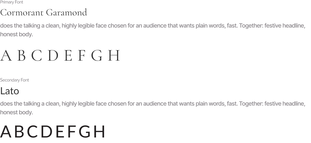
Typography
Colors

The MANAM palette creates an atmosphere of depth, warmth, and quiet sophistication. Deep plum establishes an introspective emotional environment, while muted gold introduces warmth, value, and inner illumination. White provides clarity and breathing space.
Real world Mock-ups
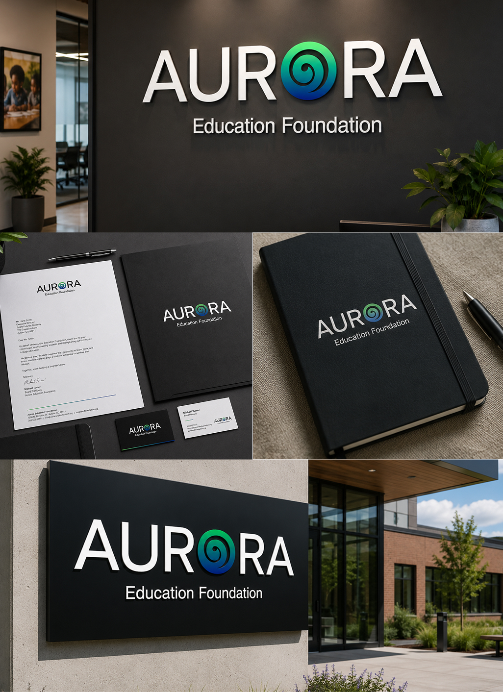
The identity should be tested where customers actually experience silk—from the first storefront impression to the final unboxing of a saree.
Real-world applications reveal whether the emblem maintains clarity at small scales, whether the gold treatment remains consistent across materials and whether the brand is recognisable across physical and digital touchpoints.
A consistent application system allows the peacock emblem to become a repeated signature, strengthening recognition at every stage of the customer journey.

.jpg)
Turn ideas like this into your next project

Jalsa Restaurant
Jalsa Restaurant came to us with a strong product and a fragmented identity. As a US based Indian restaurant built around bold, home-style flavors, the brand needed packaging and visual assets that traveled a mark that worked as well on a takeout bucket as it did on a delivery box, and that read "celebration" and "heritage" at a glance, without leaning on cliché spice-and-paisley visual shorthand. The challenge: build a system flexible enough for physical packaging, digital menus, and social content, while staying unmistakably warm and appetite-driven.
Brand Brief
Personality
Celebratory, warm, approachable human, not corporate. Traditional at heart, simple in expression.
Vision of the Business
Make everyday food feel like a celebration honest, traditional recipes, nothing artificial added.
Target Audience
Young, everyday food lovers who respond to plain talk and real flavor clear words over clever ones.
USP
Color comes from the food, not the lab. Traditional taste, no added preservatives, no artificial colors.
Logo Type
Emblem paired with a clear typeface readable in a second, festive without clutter.
Tagline
Celebrate Every Bite
Key USPs
1. Celebration-Focused Restaurant Brand
Jalsa is not just about eating food. It is about enjoying food as a happy moment with family, friends, and community.
2. Perfect for Family & Group Orders
The brand naturally suits biryani buckets, combo meals, party orders, and celebration packs.
3. Local Taste with Premium Presentation
Jalsa can feel familiar and local while still looking polished, clean, and professional.
The Vision
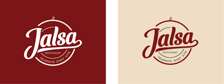
Jalsa means celebration and the identity had to carry that feeling without overcomplicating it. We set out to design something warm and approachable, with a clear typeface and an emblem that reads in a second. The food is the hero; the brand frames it.
Usage Guide

Clear Space
To ensure clarity and visual impact, always maintain adequate clear space around the logo. The minimum clear space is defined as “j”.
No text, graphics, images, or other visual elements should enter this protected area.
Positioning Map
Before sketching, we mapped the category on two axes Traditional Modern, Festive Minimal. Most food brands crowd the same two corners: modern-minimal or traditional- cluttered. Jalsa takes the open space - traditional and festive, executed simply.

1. Celebration becomes Happy
The brief asked for : A brand that feels like an occasion, not a transaction.
The decision : A flowing script wordmark that moves like handwriting at a festival loops and rises that carry momentum, joy you can read before you can read it.
Where you see it : The wordmark, front of every pack.
2. Approachable becomes Human
The brief asked for : Warmth people trust instantly, without a pitch.
The decision : Soft, rounded letterforms chosen over rigid geometry. Curves where corporate marks put corners - nothing engineered, nothing cold.
Where you see it : Every letter, every touchpoint.
3. Traditional becomes Honest
The brief asked for : Heritage that reads as credibility, not costume.
The decision : An emblem structure borrowed from classic food seals the format a century of trusted kitchens has trained buyers to believe. A mark of trust, not a trend.
Where you see it : The seal flame, circle, wordmark - on box, label, and tag.
4. Simple becomes Clear
The brief asked for : Nothing between the food and the person.
The decision : One mark. One supporting typeface. Colors taken directly from the food itself. Nothing extra survived.
Where you see it : Everywhere restraint is the system.
Concept Draw
We explored multiple angles on paper first playful hand gestures, emblem structures, type-led lockups testing different expressions of celebration before refining the strongest.

This traditional sketching approach encouraged creativity without technical limitations and helped identify the strongest visual direction. Each iteration refined the logo's proportions, hierarchy, and visual harmony until the most suitable concept was selected for further development.

From Sketch to Screen
The chosen direction became a bold emblem paired with a clean supporting typeface simple enough to read at a glance, distinctive enough to own.

The Symbol
The emblem works as a seal of celebration. The flame at its heart isn't ceremonial it's the warmth of food just off the stove, the same heat and flavor a home kitchen sends to the table. The circle that carries it runs like happiness passed around in a loop: every bite shared, every plate returned for more. Rooted in our heritage of warm, traditional custom, and sealed onto every box and label, it turns packaging into an invitation open a Jalsa parcel and you're not receiving a delivery, you're being served.

Typography

Colors

Applied a carefully selected brand color palette inspired by warmth, hospitality, rich spices, and authentic Indian cuisine to create a vibrant and memorable visual identity.
Real world Mock-ups
To validate the effectiveness of the identity, the logo was applied across a variety of real-world branding scenarios. These applications include storefront signage, restaurant interiors, menus, takeaway packaging, food containers, uniforms, social media assets, promotional materials, business stationery, and digital advertising. Testing the logo in practical environments ensures that it maintains clarity, consistency, and visual appeal regardless of scale or application. These mockups demonstrate how the brand creates a cohesive and memorable customer experience across every touchpoint.


Turn ideas like this into your next project

Intro
Epic Events operates in a world where every detail contributes to the final impression. The identity needed to communicate more than event organisation—it needed to reflect structure, confidence, precision, and the ability to create memorable corporate experiences. The challenge was to build a visual system that could feel premium in executive environments while remaining clear and adaptable across invitations, presentations, event stages, digital platforms, signage, and branded collateral. At the centre of the identity is a bold geometric monogram balanced by elegant typography, creating a brand language where corporate discipline meets elevated experience.
Brand Brief
Personality
Epic Events carries the confidence of a corporate partner with the visual presence of a premium experience brand.
Vision of the Business
To become a trusted creative force in corporate events—shaping professional occasions into thoughtfully crafted experiences that strengthen connections, celebrate achievements, and leave lasting impressions.
Target Audience
Corporate organisations, business leaders, HR and marketing teams, growing enterprises, executive communities, conference organisers, and brands seeking professionally managed events with a polished, premium presence.
USP
Corporate event experiences where disciplined execution and elevated presentation work as one.
Logo Type
The identity combines a custom EE monogram, a refined wordmark, and a supporting tagline. The monogram gives the brand a compact and recognisable visual asset, while the full wordmark establishes clarity and professional credibility.
Tagline
CelebraCrafting Corporate Excellencete Every Bite
Key USPs
1. Corporate Precision
Every experience is approached with structure, attention to detail, and a clear understanding of professional expectations.
2. Elevated Event Presence
Epic Events focuses on how an occasion looks, feels, and is remembered—turning functional events into carefully considered brand experiences.
3. Excellence Through Execution
From the first impression to the final touchpoint, consistency and refinement shape the complete event experience.
The Vision
The central idea behind Epic Events is structured excellence made memorable.
The identity needed to communicate trust and corporate confidence without appearing ordinary or overly institutional. Its visual language combines architectural geometry with elegant typography, creating a balance between precise organisation and premium experience.
The logo must perform confidently at the centre of a stage, on an executive proposal, across digital communication, or as a subtle event signature.
The creative direction: build structure with precision, then give it presence.
.png)
Usage Guide

Clear Space
The minimum clear space around the Epic Events logo is defined as X, where X equals the height of the central horizontal bar within the EE monogram.
A minimum distance of 1X should be maintained on every side of the complete logo.
Positioning Map
The corporate event category often moves between highly conventional service providers and expressive experience-focused studios. Traditional providers communicate reliability but can lack distinction, while highly creative event brands may appear less suited to executive corporate environments.
Epic Events occupies the strategic space between corporate discipline and premium experience—a brand that feels structured enough for business and distinctive enough to own the room.
.png)
1. Structure becomes confidence
The brief asked for : A corporate identity capable of communicating control, organisation, and professional reliability.
The decision : Build the core symbol from strong horizontal and vertical geometric forms. The controlled arrangement creates visual stability and gives the monogram an architectural quality.
Where you see it : The squared construction of the EE monogram, its aligned edges, repeated horizontal bars, and balanced overall silhouette.
2. Connection becomes experience
The brief asked for : An identity that could represent events as spaces where organisations, teams, and people come together.
The decision : Interlock two letterforms into a single unified symbol rather than presenting each initial separately.
Where you see it : The two E forms visually meet at the centre, creating one connected monogram with shared visual rhythm.
3. Precision becomes trust
The brief asked for : A visual language that reflects attention to detail and carefully managed execution.
The decision : Use controlled geometry, consistent visual weight, and intentional angular cuts to give every section of the symbol a deliberate role.
Where you see it : The sharp internal corners, aligned horizontal elements, repeated proportions, and precise diagonal cuts within the monogram.
4. Legance becomes presence
The brief asked for : A premium identity that could stand confidently within executive and high-value corporate environments.
The decision : Contrast the bold geometric symbol with a high-contrast serif wordmark and restrained monochrome palette.
Where you see it : The relationship between the powerful EE symbol, the elegant EPIC EVENTS typography, and the minimal tagline composition beneath it.
Concept Draw
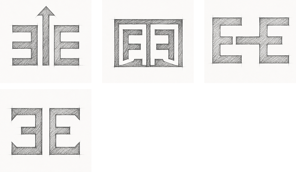
The early concept stage explored multiple ways of transforming the initials E and E into a recognisable corporate symbol. Hand sketches tested mirrored letterforms, connected structures, architectural frames, negative-space relationships, and modular compositions. Typography was explored alongside the symbol to understand how a bold monogram could coexist with a more elegant wordmark.
Through iteration, the strongest direction emerged from a balanced geometric structure. Proportion, hierarchy, spacing, and internal alignment were refined to create visual harmony between the symbol, brand name, and tagline.
From Sketch to Screen
The chosen direction became a bold emblem paired with a clean supporting typeface simple enough to read at a glance, distinctive enough to own.
.png)
The Symbol
The two E structures combine into a unified visual signature. The result represents Epic Events as the framework that brings separate elements together and transforms them into one cohesive experience.
Visual display suggestion: Present the first E construction on the left, the mirrored structure in the centre, and the completed EE monogram on the right. Use thin construction lines and a minimal plus-and-equals equation.

Typography
Colors
.png)
Applied a carefully selected brand color palette inspired by warmth, hospitality, rich spices, and authentic Indian cuisine to create a vibrant and memorable visual identity.
Real world Mock-ups
To validate the effectiveness of the identity, the logo was applied across a variety of real-world branding scenarios. These applications include storefront signage, restaurant interiors, menus, takeaway packaging, food containers, uniforms, social media assets, promotional materials, business stationery, and digital advertising. Testing the logo in practical environments ensures that it maintains clarity, consistency, and visual appeal regardless of scale or application. These mockups demonstrate how the brand creates a cohesive and memorable customer experience across every touchpoint.
.png)
Turn ideas like this into your next project
.png)
Intro
MANAM needed an identity capable of expressing something deeply personal without becoming visually complicated. Positioned around the idea of finding one's voice from within, the brand required a visual system that could feel calm, intimate, credible, and quietly empowering.
The challenge was to translate an invisible inner journey into a distinctive visual language. The identity needed to communicate reflection and personal expression while remaining professional enough for coaching, workshops, digital platforms, guided programmes, and intimate one-to-one experiences.
The result is a brand system centred on inner connection — where structured geometry, flowing lines, and a restrained premium palette create a visual voice that feels considered, human, and emotionally resonant.
Brand Breif
Personality
MANAM speaks with quiet confidence. It does not demand attention; it creates space for people to listen, reflect, and express themselves authentically.
Vision of the Business
To create a trusted space where individuals can reconnect with their inner voice, develop confidence in self-expression, and communicate from a place of greater clarity and awareness.
Target Audience
Thoughtful individuals, emerging professionals, creatives, leaders, and personal-growth seekers who want to strengthen their voice, confidence, communication, and connection with themselves.
USP
An inside-out approach to authentic expression — helping people discover their voice before teaching them how to project it.
Logo Type
The identity combines a distinctive linear symbol with a spacious MANAM wordmark. The symbol carries the emotional and conceptual story, while the wordmark gives the brand clarity and authority.
This structure allows MANAM to move between expressive storytelling and minimal professional communication.
Tagline
Find Your Voice From Within
Key USPs
1. Corporate Precision
MANAM begins with self-awareness, helping expression emerge from genuine internal clarity rather than surface-level performance.
2. Elevated Event Presence
The brand connects voice with purpose, encouraging communication that feels considered, confident, and personally meaningful.
3. Excellence Through Execution
MANAM positions development as a reflective journey, creating an experience that feels supportive, premium, and deeply human.
The Vision
The central idea behind MANAM is simple: the strongest voice begins within.
The identity needed to communicate a sense of inner stillness gradually becoming visible expression. Rather than using obvious symbols of speech or communication, the visual direction explores connection, rhythm, repetition, and centred form.
The logo needed to feel personal without appearing informal, spiritual without becoming mystical, and premium without creating emotional distance.
Flowing gold lines introduce warmth and movement, while the deep plum environment creates introspection and depth. The balanced composition reinforces calm and intentionality.
The creative direction turns inner awareness into a visible, confident form.
.png)
Usage Guide
.png)
Clear Space
The minimum clear space around the MANAM logo is defined as X, where X equals the diameter of the circular form positioned above the central symbol.
A minimum distance of 1X should be maintained on every side of the complete logo lockup.
No text, graphics, images, borders, or other visual elements should enter this protected area.
For the case study, demonstrate the rule by placing a measurement circle marked X beside the logo and repeating the same circular unit around the outer logo boundary using subtle construction lines.
Positioning Map
The personal-development and communication space often sits between two extremes: highly corporate performance coaching and overtly spiritual self-discovery.
MANAM occupies the open space between these worlds. It feels emotionally aware and human while maintaining the visual discipline of a premium contemporary brand.
.png)
1. Innerness becomes Presence
The brief asked for : A brand identity that could communicate personal discovery without relying on predictable self-help imagery.
The decision :Build the symbol from inward-facing, repeated linear forms that visually draw attention toward a central core.
Where you see it : The mirrored curves of the symbol move inward and meet around the central vertical structure, creating a visual sense of focus and internal alignment.
2. Voice becomes Rhythm
The brief asked for : A visual connection to expression that feels subtle, intelligent, and ownable.
The decision : Translate the rhythm of voice into repeated vertical curves rather than using liteal microphones, speech bubbles, or sound icons.
Where you see it : The symbol's continuous gold lines create a waveform-like repetition, suggesting resonance, breath, and a voice moving through space.
3. Vulnerability becomes Confidence
The brief asked for : An identity that feels emotionally open while still carrying professional authority.
The decision : Balance soft rounded geometry with a highly controlled, symmetrical composition.
Where you see it : The curved symbol creates warmth and approachability, while its central alignment, repeated proportions, and structured wordmark create visual confidence.
4. Stillness becomes Clarity
The brief asked for : A visual system that creates space for reflection and focused communication.
The decision : Use restrained colour, generous negative space, and minimal visual elements to remove unnecessary noise.
Where you see it : The isolated symbol, wide letter spacing, centred lockup, and deep plum background give every element room to breathe.
Concept Draw
The early concept stage explored multiple ways to transform voice, self-awareness, and inner connection into a distinctive visual form.
Hand sketches tested sound waves, mirrored human forms, abstract letter structures, centred pathways, and continuous line symbols.Typography and symbol compositions were explored simultaneously to understand how the emotional softness of the mark could balance with a refined wordmark. Repeated iterations focused on curve tension, line rhythm, proportion, hierarchy, and the relationship between the upper circular detail and the central structure.
The strongest direction emerged when the symbol stopped illustrating voice literally and began feeling like voice visually. From there, the form was simplified and refined to achieve greater harmony and recognition.
.png)
.png)
From Sketch To Screen
The selected concept was digitally reconstructed using consistent line weights, controlled curves, and mirrored geometry.Proportions were adjusted to strengthen the relationship between the central form and outer arches. Typography was spaced to complement the symbol's openness, while alignment and scale tests ensured the complete mark remained readable and distinctive across large and small applications.
The final refinement created a symbol that feels simple at first glance but reveals deeper meaning through its structure
.png)
The Symbol
The MANAM symbol feels like a voice before it becomes a word.
Its repeating curves rise and return in a quiet rhythm, suggesting breath, resonance, and thoughts moving from an internal space toward expression. The central structure creates a point of focus — an inner core held between mirrored forms.
At another level, the symbol can be seen as two human presences facing inward, connected through a shared centre. The small circle above introduces a sense of awareness: a thought, a conscious self, or the moment of recognition that happens before expression.
Its geometry gives the brand stability, while the uninterrupted linear rhythm keeps the symbol emotionally fluid.Compact, distinctive, and independent from the wordmark, the symbol can become a recognisable brand signature across digital interfaces, printed materials, spaces, and intimate customer touchpoints.
Typography
.png)
Colors
.png)
The MANAM palette creates an atmosphere of depth, warmth, and quiet sophistication. Deep plum establishes an introspective emotional environment, while muted gold introduces warmth, value, and inner illumination. White provides clarity and breathing space.
Real World Mock - Ups
To validate the effectiveness of the identity, the logo was applied across a variety of real-world branding scenarios. These applications include storefront signage, restaurant interiors, menus, takeaway packaging, food containers, uniforms, social media assets, promotional materials, business stationery, and digital advertising. Testing the logo in practical environments ensures that it maintains clarity, consistency, and visual appeal regardless of scale or application. These mockups demonstrate how the brand creates a cohesive and memorable customer experience across every touchpoint.
.png)

Turn ideas like this into your next project
Intro
Bossonomics is positioned at the intersection of beauty expertise and business ambition. The brand needed an identity capable of speaking to service professionals who have mastered their craft but are ready to think beyond appointments, treatments, and day-to-day delivery. The challenge was to create a visual system that felt commercially intelligent without becoming traditionally corporate, and ambitious without losing the energy of the beauty industry. The identity needed to work across coaching programmes, digital education, social content, presentations, events, and business resources. At its centre was one clear challenge: make business growth feel bold, accessible, and built for beauty entrepreneurs.
Brand Brief
Personality
Bold, ambitious, financially aware, energetic, direct, empowering, and commercially confident.
Vision of the Business
To help beauty professionals shift their mindset from simply providing a service to building structured, scalable, and profitable beauty businesses.
Target Audience
Independent beauty professionals, salon owners, beauty educators, emerging founders, and service-based entrepreneurs ready to strengthen their pricing, systems, revenue thinking, and business confidence.
USP
Business growth thinking translated specifically for the beauty service economy.
Logo Type
The identity is led by a powerful custom wordmark, with the central dollar-bill construction functioning as a graphic symbol inside the name. This approach keeps the brand memorable while immediately connecting the ideas of leadership, money, and business growth.
Tagline
Think Bigger. Build Smarter.
Key USPs
1. Corporate Precision
Bossonomics connects industry understanding with commercially focused thinking, making business growth more relevant to beauty professionals.
2. Elevated Event Presence
The brand focuses on the transition from selling personal time to building stronger systems, structures, and long-term business value.
3. Excellence Through Execution
Revenue, pricing, and growth are brought into the conversation with confidence rather than being hidden behind traditional beauty language.
The Vision
The central idea is transformation: from skilled practitioner to strategic business owner. The identity should communicate ambition, confidence, and financial possibility while retaining the energy of a modern beauty brand.The logo needed to feel immediately visible, commercially sharp, and memorable enough to lead educational content, events, digital programmes, and entrepreneurial conversations. Bold typography establishes authority, while the money-inspired centre introduces a disruptive visual moment.
The creative direction turns business ambition into a visual badge of ownership.

Usage Guide

Clear Space
The minimum clear space around the Bossonomics logo is defined as X, where X equals the width of one dollar-sign vertical stem within the central green money form.
A minimum distance of 1X should be maintained on every side of the complete logo lockup.
No text, graphics, images, borders, or other visual elements should enter this protected area.
For the case study, isolate the dollar-sign stem as the X measurement unit and repeat this unit around the outer boundary of the logo using fine construction lines.
Positioning Map
The beauty-business category often sits between soft motivational coaching and formal corporate consultancy. Bossonomics occupies the open space between these extremes: visually bold, commercially focused, and highly entrepreneurial.
Its position should feel more financially direct than lifestyle coaching and more energetic and human than traditional business consultancy.

1. Authority becomes Confidence
The brief asked for : A brand presence strong enough to speak to ambitious beauty business owners.
The decision : Use oversized, heavy typography to create immediate authority and visual impact.
Where you see it : In the dominant uppercase BOSSONOMICS wordmark, where thick letterforms create a confident and unapologetic presence.
2. Money becomes Possibility
The brief asked for : A visual idea that makes financial growth central to the brand conversation.
The decision : Transform the centre of the wordmark into a money-inspired graphic using two dollar signs and a banknote-like green frame.
Where you see it : n the “$$” centrepiece, positioned directly inside the brand name as a visible expression of revenue and commercial ambition.
3. Transformation becomes Momentum
The brief asked for : An identity that communicates progression beyond the service-provider mindset.
The decision : Create a visual interruption in the wordmark, allowing the central money form to act as a point of transformation.
Where you see it : The green financial graphic breaks the continuous navy typography, creating a visual shift from one state to another.
4. Stillness becomes Clarity
The brief asked for : A brand that encourages beauty professionals to think and act like business leaders.
The decision : Build the identity around the visual language of scale, confidence, and financial ownership rather than traditional beauty symbols.
Where you see it : In the bold wordmark, capital-letter construction, financial iconography, and the deliberate absence of predictable beauty imagery.
Concept Draw
Early concept exploration focused on finding the right intersection between boss mentality and business economics. Multiple visual directions were tested through hand sketches, typographic experiments, financial symbols, letter substitutions, and integrated wordmark structures.
The composition was repeatedly refined to balance the central financial idea with the wider brand name. Proportion, spacing, hierarchy, and visual rhythm were explored to ensure the symbol felt intentionally built into the word rather than simply placed over it.
The strongest direction emerged when the money concept became part of the name itself, creating a single connected visual idea.


From Sketch To Screen
The selected concept was digitally refined by simplifying the money form, strengthening the dollar symbols, and balancing the central graphic against the heavy wordmark. Letter spacing, alignment, scale, and overall proportion were adjusted to improve readability and visual rhythm.
The result is a distinctive wordmark that remains bold at large scale while retaining its central idea across digital and branded applications.

The Symbol
The heart of Bossonomics is a moment where language becomes money.
At the centre of the wordmark, two dollar signs sit inside a green form reminiscent of a simplified banknote. The visual does more than reference revenue; it marks the exact point where a service mindset begins to transform into a business mindset.The paired dollar signs amplify the idea of growth, while the enclosed form gives financial ambition structure and focus. Its geometry is direct, compact, and immediately recognisable, creating a visual device that can live beyond the complete logo.Across social graphics, educational materials, programme assets, and merchandise, the symbol becomes a shorthand for a larger idea: beauty skills can build serious business value.

Typography

Colors

The Bossonomics palette combines deep navy authority with energetic financial green. Navy creates credibility and leadership, while green introduces growth and money into the visual language with immediate clarity. Black keeps supporting communication grounded and highly readable. Together, the colours create a commercially confident palette that feels bold enough for entrepreneurial content while remaining relevant to the modern beauty-business space.
Real world Mock-ups
The Bossonomics identity should be tested across the environments where education, business growth, and beauty entrepreneurship meet. Real-world applications demonstrate whether the logo maintains clarity at different scales, whether the financial symbol remains recognisable, and whether the wider identity feels consistent across customer touchpoints.
Both physical and digital applications should reinforce the same bold, commercially focused personality.

Turn ideas like this into your next project
Intro
Vedhaa’s Silks needed an identity capable of carrying the visual richness of silk without becoming ornamental for ornament's sake. In a category filled with traditional motifs, decorative typography and familiar cultural symbols, the challenge was to build a brand presence that felt rooted in heritage yet immediately ownable.
The identity needed to hold its elegance across saree packaging, textile labels, shopping bags, storefront communication and digital platforms. The central challenge was clear: translate the movement, prestige and ceremonial beauty associated with silk into a strong visual signature that customers could recognise before reading the name.
The result is a brand system where the peacock becomes more than decoration—it becomes the visual embodiment of silk itself.
Brand Brief
Personality
Regal, graceful, expressive, traditional, feminine and refined.
Vedhaa’s Silks carries the confidence of ceremonial luxury while remaining emotionally connected to the beauty of Indian textile culture.
Vision of the Business
To build a distinctive silk brand where every customer touchpoint celebrates the elegance, movement and cultural significance of traditional draping.
Target Audience
Women and families seeking silk sarees and traditional garments for weddings, celebrations, ceremonies and meaningful occasions.
The identity particularly speaks to customers who value cultural beauty, visual richness and a premium presentation experience.
USP
Silk elegance expressed through a distinctive peacock-led brand experience.
Logo Type
The identity combines a self-contained peacock emblem with an elegant serif wordmark. This structure gives Vedhaa’s Silks both visual recognition and name clarity.
The emblem can independently appear on labels, packaging seals and social media, while the complete lockup creates a formal and established retail presence.
Tagline
Grace in Every Drape
Key USPs
1. Occasion-Led Elegance
The brand is positioned around meaningful moments where silk becomes part of celebration, memory and personal expression.
2.A Distinctive Silk Signature
The peacock-inspired identity creates a recognisable visual language that separates Vedhaa’s Silks from conventional textile branding.
3.Tradition with Premium Presence
Cultural cues are presented through controlled composition, rich colour and refined detailing, giving traditional silk a more elevated brand experience.
The Vision
The creative vision was to make silk visible before it was touched.
The identity needed to communicate softness, movement and ceremonial grandeur while creating the confidence expected from a premium textile brand. Rather than illustrating a saree directly, the visual direction translates the natural flow of fabric into the layered feathers of a peacock.
Gold brings richness. Deep red brings celebration. The serif typography creates poise and heritage.
Every element works toward one central idea: to turn the grace of silk into a visual signature.

Usage Guide
Clear Space
The minimum clear space around the Vedhaa’s Silks logo is defined as X, where X equals the width of the gold outer border of the peacock emblem multiplied by four.
A minimum distance of 1X should be maintained on every side of the complete logo lockup.
No text, graphics, images or other visual elements should enter this protected area.
For the case study, isolate the border-based measurement as a small gold rectangular unit marked X, then repeat the same unit around the outer edges of the logo to visually demonstrate the protected space.
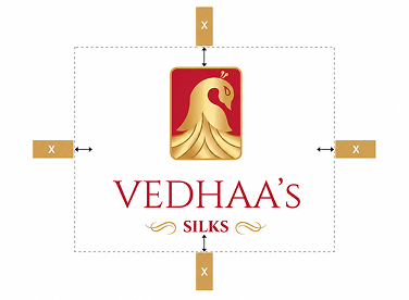
Positioning Map
The traditional silk category often moves between two extremes: highly conventional heritage retailers and visually modern fashion brands that reduce cultural character in favor of minimalism.
Vedhaa’s Silks occupies a more expressive premium position. It preserves recognizable Indian cultural cues while giving them a polished, brand-led presence.
The opportunity sits where Heritage meets Expressive Luxury.

1. Grace becomes Movement
The brief asked for : A visual identity that could communicate the flowing elegance associated with silk.
The decision : The peacock's lower form was constructed using repeated sweeping curves that visually behave like layered folds of fabric.
Where you see it : The descending gold feather forms move outward and downward, creating the impression of a silk saree opening into a graceful drape.
2. Heritage becomes Prestige
The brief asked for : A traditional identity that felt elevated rather than visually old-fashioned.
The decision : Familiar cultural cues were paired with a controlled emblem structure, metallic gold treatment and high-contrast serif typography.
Where you see it : The peacock, deep ceremonial red and gold detailing establish heritage, while the refined rectangular frame gives the symbol a formal premium presence.
3. Beauty becomes Recognition
The brief asked for : A memorable brand symbol capable of becoming identifiable independently from the wordmark.
The decision : The peacock was simplified into one dominant silhouette with a distinctive curved neck and layered tail structure.
Where you see it : The negative space around the peacock's neck, the eye detail and the flowing feather construction create a recognisable visual signature.
4. Celebration becomes Colour
The brief asked for : A colour language that could express the emotional richness of traditional silk occasions.
The decision : A deep red and luminous gold palette was used to create immediate associations with ceremony, richness and festive elegance.
Where you see it : Red anchors the emblem and wordmark, while layered gold moves across the peacock, border and ornamental flourishes.
Concept Draw
The early concept process explored multiple interpretations of silk, movement and the peacock form through hand sketches and rapid structural studies. Initial directions investigated complete birds, abstract feather systems, fabric folds, traditional frames and monogram-led compositions.
Typography was explored alongside the symbol to understand how a formal serif structure could balance the organic movement of the peacock. Repeated iteration focused on proportion, neck curvature, feather rhythm, emblem dimensions and hierarchy between symbol and name.
The strongest direction emerged when the peacock's tail began to behave like draped silk. This visual connection created the most meaningful balance between product, culture and brand recognition and became the foundation for digital refinement.
.png)
From Sketch To Screen
The selected concept moved into digital refinement through careful simplification of the peacock silhouette and repeated adjustment of the feather curves.
The body-to-tail proportion was balanced to create a stronger vertical structure, while the emblem frame established consistent alignment. Typography was refined to complement the symbol without competing with its detail.
Scalability, readability and distinctiveness guided each adjustment, resulting in a mark that retains its character across both complete logo lockups and symbol-led applications.
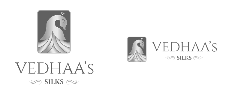
The Symbol
The Vedhaa’s symbol begins with a peacock, but its story ends in silk.
The bird rises with a quiet, poised curve before its body opens into layers of flowing gold. These layers feel less like individual feathers and more like fabric falling into carefully arranged pleats. The transformation connects the natural grace of the peacock with the movement of a silk saree.
The rectangular red frame gives this movement a place of importance. It turns the bird into an emblem—something presented, remembered and repeated.
Strategically, the symbol brings product and emotion together. Silk is represented through flow. Celebration is carried through red. Premium character is expressed through gold.
Its distinctive silhouette allows the emblem to live independently on woven labels, boxes, seals, bags and digital icons, giving Vedhaa’s Silks a recognisable signature beyond the full wordmark.

Typography
Colors

A grounding neutral that intensifies the red and gold palette while creating a dramatic premium presentation environment.
The Vedhaa’s Silks palette is intentionally rich and ceremonial. Red creates emotional recognition, while layered gold tones capture the changing light and lustre of silk. Black provides contrast and visual depth. Together, the colours create an expressive premium system directly connected to the identity's traditional and occasion-led personality.
Real world Mock-ups
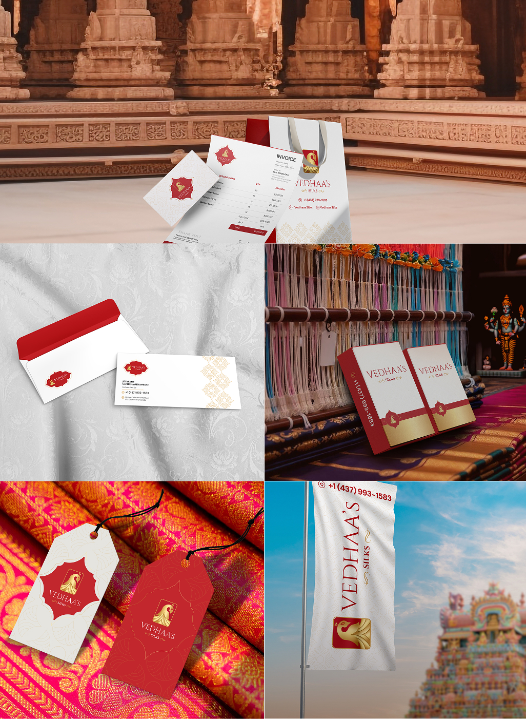
The identity should be tested where customers actually experience silk—from the first storefront impression to the final unboxing of a saree.
Real-world applications reveal whether the emblem maintains clarity at small scales, whether the gold treatment remains consistent across materials and whether the brand is recognisable across physical and digital touchpoints.
A consistent application system allows the peacock emblem to become a repeated signature, strengthening recognition at every stage of the customer journey.
Turn ideas like this into your next project
.jpg)
Intro
Kenyaetta McLeod — The Catalyst required an identity capable of representing more than a personal name. The brand needed to visually carry the presence of a leader, speaker and transformational voice whose role is to ignite confidence, challenge hesitation and encourage purposeful action.
The central identity challenge was balance. The brand had to feel powerful without becoming aggressive, motivational without relying on familiar coaching clichés, and deeply human while maintaining the authority expected from a leadership-focused personal brand.
A stronger visual system was necessary to create consistency across speaking platforms, leadership content, digital communication, social media, presentations and future branded resources. The identity therefore centres on a distinctive flame-and-profile symbol, supported by expressive editorial typography and an energetic colour transition.
The result is a brand language designed around one central challenge: how do you make transformation visible before a single word is spoken?
Brand Brief
Personality
The brand carries the confidence of a strong leader but communicates through human connection rather than corporate distance. Its personality is courageous, emotionally intelligent and action-oriented — a voice that does not simply inspire people to listen, but encourages them to move.
Vision of the Business
To build a recognisable leadership platform that helps individuals and teams turn personal conviction into meaningful action. The larger ambition is to make courageous leadership feel accessible, practical and deeply personal — encouraging people to recognise their own ability to influence change.
Target Audience
Emerging leaders, professionals, entrepreneurs, women in leadership, organisational teams and purpose-driven individuals navigating growth, responsibility or transition.
The audience is ambitious but may be facing moments of uncertainty, pressure or self-doubt. They are not searching for empty motivation. They are looking for clarity, confidence and a stronger internal foundation from which to lead.
USP
Leadership transformation that begins with inner grit and becomes visible through decisive action.
Logo Type
The identity combines a distinctive symbolic mark with a personality-led wordmark and supporting tagline. This structure suits a personal leadership brand because it establishes the name as the central authority while allowing the flame-profile symbol to develop independent recognition.
The symbol can become a visual signature across social media, event environments and compact digital applications, while the full lockup communicates the complete brand story.
Tagline
Leading with GRIT
Key USPs
1.Leadership from Within
The brand positions personal conviction as the starting point ofeffective leadership. Confidence is not presented as performance; it isdeveloped through clarity, resilience and a stronger understanding of personal purpose.
2.Inspiration that Creates Action
The Catalyst is not simply a motivational voice. The positioning centres on movement — turning insight into decisions, challenges into momentum and leadership ideas into practical behavioural change.
3.A Human Voice with Bold Presence
The identity combines emotional accessibility with visual authority.
This allows the brand to connect personally with individuals while maintaining enough strength and confidence for professional leadership environments.
The Vision
The creative vision began with the idea of the internal spark — the moment when a thought, challenge or conversation creates enough energy to change direction.
The identity needed to communicate courage, momentum and transformation. It had to capture the emotional intensity associated with personal growth while remaining recognisable as a leadership brand centred around a real human voice.
The flame became the visual expression of energy. The human profile introduced identity and personal potential. Strong editorial typography established authority and intellectual presence. Together, these elements create a visual language that feels active, expressive and impossible to separate from the idea of transformation.
The logo does not portray leadership as a position.
It portrays leadership as an ignition point.

Usage Guide
Clear Space
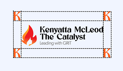
The minimum clear space around the Kenyaetta McLeod — The Catalyst logo is defined as k, where k equals the width of the white facial profile at its widest central point within the flame symbol.
A minimum distance of 1X should be maintained on every side of the complete logo lockup.
No text, graphics, images or other visual elements should enter this protected area. Maintaining this space preserves the relationship between the symbol, name and tagline while allowing the identity to retain its strong visual presence.
Visual demonstration suggestion: Isolate the widest section of the white profile as a small measurement unit labelled k. Repeat the x unit around the four outer boundaries of the complete logo lockup using fine construction lines.
Positioning Map
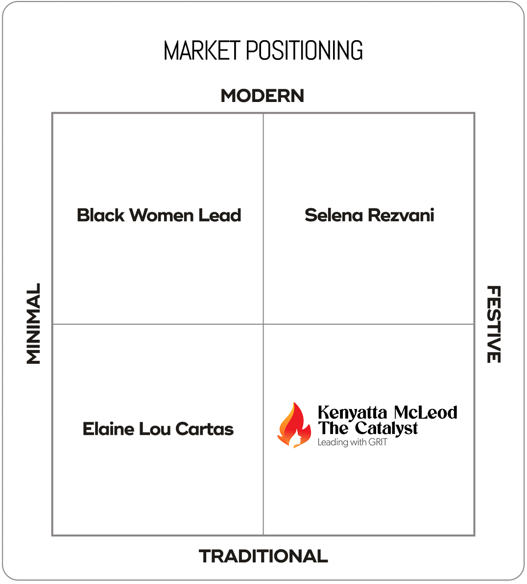
The leadership and personal development category often sits between two extremes. Traditional leadership brands can feel highly corporate and distant, while motivational personalities may become visually loud, generic or overly performance-driven.
Kenyaetta McLeod — The Catalyst occupies a more distinctive position: human and transformational, supported by bold professional presence.
The open strategic territory exists where emotional connection meets strong leadership authority. The brand should feel personal enough to create trust, yet expressive enough to represent energy, change and momentum.
1. Grace becomes Movement
The brief asked for : A visual identity that could immediately communicate energy, transformation and the power to initiate change.
The decision : Fire was treated as a symbol of activation rather than destruction. Its rising movement creates a sense of progress, while the layered flame shapes suggest energy building from a small internal source into a larger external force.
Where you see it : The upward red and orange flame structure dominates the symbol. Its pointed curves, rising silhouette and warm colour transition make movement an immediate part of the brand's visual character.
2. Heritage becomes Prestige
The brief asked for : A leadership identity with enough authority to feel professional without losing the personal voice at the centre of the brand.
The decision : A human profile was integrated directly into the negative space of the flame. Instead of separating the person from the idea of transformation, both were constructed as one visual story.
Where you see it : The white facial silhouette emerges from the lower centre of the symbol. The profile is not placed on top of the flame; it is revealed by the flame's surrounding form, making human potential the hidden centre of the mark.
3. Beauty becomes Recognition
The brief asked for : A brand that could communicate resilience and confidence without relying on aggressive or traditionally masculine leadership imagery.
The decision : Strong, high-contrast typography was selected to create visual authority. The weight and dramatic serif construction establish confidence, while the sculpted letterforms preserve sophistication and individuality.
Where you see it : The large treatment of Kenyaetta McLeod and The Catalyst creates immediate hierarchy. Heavy black letterforms contrast against the energetic symbol, visually grounding the fire with stability and conviction.
4. Celebration becomes Colour
The brief asked for : A memorable personal brand symbol capable of representing both the individual and the larger purpose behind her leadership platform.
The decision : The flame and profile were fused into a single silhouette. This creates a visual double meaning: the viewer first recognises energy, then discovers the person within it.
Where you see it : The complete emblem shifts between two readings — a rising flame and a human profile. This visual discovery creates memorability and turns the symbol into a metaphor for internal transformation becoming externally visible.
Concept Draw
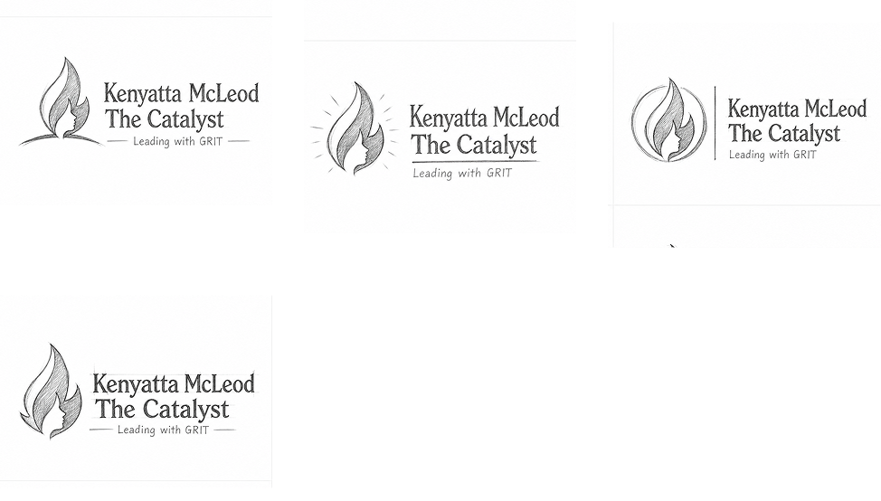
The early concept process explored multiple visual interpretations of ignition, leadership and personal transformation through rapid hand sketches and structural studies. Initial directions investigated standalone flames, profile silhouettes, abstract sparks, upward movement and monogram-based structures.
Human profiles were explored alongside different flame geometries to understand how negative space could connect the person and the catalyst idea without creating a literal portrait. Typography studies tested expressive serif structures against modern sans serif systems, helping establish a balance between authority and accessibility.
Repeated iteration focused on the angle of the facial profile, flame rhythm, internal negative space, symbol width and the visual hierarchy between the emblem, personal name and The Catalyst descriptor.
The strongest direction emerged when the human profile stopped being an additional element and became part of the flame itself. This visual relationship was refined through proportion, curve control and compositional balance until the two ideas could exist as one memorable symbol.
From Sketch To Screen
The selected flame-profile concept was digitally reconstructed with greater control over curve flow, internal spacing and visual weight. The outer flame was refined to create a stronger upward rhythm, while the facial silhouette was simplified for clarity at reduced sizes.
Typography was aligned to create a confident horizontal lockup, with careful attention given to the relationship between the symbol, personal name, The Catalyst descriptor and supporting tagline.
Proportion, readability and scalability guided every refinement, allowing the final identity to remain expressive at large scale while retaining a distinctive silhouette in compact applications.

The Symbol
The symbol begins with fire, but its story is about the person inside it.At first glance, the rising form carries the familiar energy of a flame — active, warm and constantly moving upward. Look closer and a human profile appears within the negative space. The discovery changes the meaning of the mark. Fire is no longer simply surrounding the individual; the person becomes part of its structure.
This relationship reflects the central idea behind The Catalyst. Transformation is not presented as something handed to a person from the outside. The potential already exists within them. The right challenge, voice or moment simply gives that potential a reason to ignite.
The curved geometry gives the mark a natural sense of movement. Large rising forms create strength, while smaller internal curves guide the eye toward the profile. The red-to-orange transition reinforces heat, energy and progression.Its double meaning makes the symbol memorable. It can operate independently as a social avatar, speaking-stage graphic, presentation device or branded content signature while continuing to carry the central story of the identity.

Typography

Colors

The palette moves from heat to authority. Red and orange create an emotionally charged visual signature connected to energy, courage and catalytic movement, while black establishes leadership presence and professional confidence. Grey provides a quieter supporting layer for secondary communication.
The warm gradient increases recognition by turning the flame into the most energetic point of the identity. Against white, the palette feels direct and optimistic. Against black, the warm colours become more dramatic and stage-ready. This flexibility supports both personal, human communication and high-impact leadership applications. The colour values are based on the visible logo artwork supplied for the case study.
Real world Mock-ups
A leadership identity must be tested where influence actually happens — on stage, on screen, inside presentations and across repeated moments of communication.
Real-world applications allow the identity to demonstrate logo clarity at different scales and maintain consistency between high-impact event environments and smaller digital customer touchpoints. The flame symbol should remain recognisable from a distant stage backdrop while the complete combination mark must retain hierarchy across websites, workbooks and professional documents.
Testing the brand across physical and digital applications also reveals the strength of the identity system beyond the primary logo. Colour, typography, symbol crops and graphic flame forms can build recognition even when the complete lockup is not present.


Turn ideas like this into your next project

Intro
RR Electrical Agencies operates in a category where trust is built through reliability, technical confidence and the ability to respond with clarity. The identity needed to move beyond the visual conventions of generic electrical service brands and establish a stronger, more ownable presence.
The challenge was to create a visual system that could communicate electricity without relying on the predictable lightning-bolt language of the industry. It needed to feel bold enough for vehicles and site signage, structured enough for professional communication and simple enough to remain clear across uniforms, service documents and digital platforms.
At the centre of the identity is a custom RR letterform integrated with an electrical plug connection—turning the brand initials themselves into a visual expression of power and service.
The result is an identity designed to feel immediate, energetic and dependable.
Brand Brief
Personality
RR Electrical Agencies has a strong, practical personality. The brand does not need unnecessary complexity or decorative language. It communicates through confidence, clarity and action.
Vision of the Business
To build a recognisable electrical service identity associated with dependable connections, capable workmanship and professional support.
The larger vision is to create a brand that feels ready for both everyday electrical requirements and growing technical demands—remaining visible, trusted and consistent wherever the service is experienced.
Target Audience
The identity is positioned for:
- Residential property owners
- Commercial businesses
- Property managers
- Contractors and builders
- Facility teams
- Local businesses requiring electrical support
- Customers seeking dependable technical service
The audience values response, reliability and professional execution more than unnecessary complexity.
USP
A direct, dependable electrical service brand built around the idea of keeping people, properties and operations connected.
Logo Type
The logo is constructed around a dominant RR monogram, supported by the Electrical Agencies wordmark.
Rather than placing an unrelated electrical icon beside the name, the electrical idea is physically integrated into the letter structure. The plug becomes part of the first “R”, making the industry connection inseparable from the brand initials.
This approach creates stronger recall and gives RR a distinctive visual asset that can function independently at smaller scales.
Tagline
Find Your Voice From Within
Key USPs
1. Dependable by Design
The brand is positioned around consistency and reliability—creating confidence that electrical requirements will be approached with professional focus and practical clarity.
2. Direct Technical Support
A straightforward service personality removes unnecessary complexity and keeps communication clear, responsive and easy to understand.
3. Connected to Every Requirement
From individual electrical needs to broader property and business applications, the brand is built to represent flexible electrical support across multiple customer touchpoints.
The Vision
The central brand idea is connection.
Electricity is invisible, but its impact is immediate. A successful electrical identity should communicate that same sense of energy: direct, functional and constantly moving.
The RR identity needed to create confidence before a conversation even begins. It had to appear strong on a vehicle, clear on workwear, recognisable on signage and professional across digital communication.
Visually, the direction combines bold letter geometry, electrical symbolism and high-impact red to create an identity that feels active without becoming aggressive.
The logo does not simply represent an electrical business.
It turns the moment of connection into the visual language of the brand.
Usage Guide
Clear Space
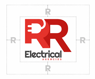
The minimum clear space around the RR Electrical Agencies logo is defined as R, where R equals the height of one horizontal plug pin visible within the first R symbol.
A minimum distance of 1X should be maintained on every side of the complete logo lockup.
No text, graphics, images or other visual elements should enter this protected area.
This spacing allows the bold RR construction to remain dominant and ensures the supporting wordmark retains clarity across physical and digital applications.
Visual Demonstration Suggestion:
Isolate one horizontal plug pin as a small red rectangular measurement unit labelled X.
Repeat the X unit around the outer boundaries of the complete logo and use fine construction lines to demonstrate the protected area.
Positioning Map
The electrical service category often sits between two visual extremes. On one side are conventional service identities built from lightning bolts, tools and generic electrical symbols. On the other are highly corporate technical brands that can feel distant and industrial.
RR occupies a more distinctive space: bold and contemporary, yet direct and approachable.
Its custom monogram creates visual ownership, while the integrated plug provides immediate category recognition. This allows the brand to feel more progressive than a traditional local contractor without losing the practical confidence customers expect from an electrical service provider.

1. Innerness becomes Presence
The brief asked for : An identity that communicates electrical expertise immediately without using an obvious standalone lightning symbol.
The decision : Integrate the electrical plug directly into the structure of the RR monogram.
The plug is not added as decoration. It becomes a functional part of the letterform, allowing the industry idea and brand initials to exist as one visual thought.
Where you see it : Inside the first R, where the white plug form and horizontal pins interrupt the red geometry and create the central point of connection.
2. Voice becomes Rhythm
The brief asked for : A visual identity with enough strength and movement to represent an active service business.
The decision : Use large, forward-facing letterforms, diagonal R legs and a saturated red palette to create visual momentum.
The geometry avoids feeling static. The lower diagonal structures appear to extend outward, giving the monogram a sense of direction.
Where you see it : In the extended diagonal legs of both R forms and the strong transition from bright electrical red to deeper red.
3. Vulnerability becomes Confidence
The brief asked for : A logo capable of working quickly across vehicles, uniforms, signage and compact digital environments.
The decision : Reduce the core identity to two initials and one industry-defining visual intervention.
The limited number of elements creates a stronger silhouette and allows the mark to be recognised before every detail is consciously read.
Where you see it : In the dominant RR construction, the simplified plug silhouette and the compact stacked relationship between the monogram and wordmark.
4. Stillness becomes Clarity
The brief asked for : A brand presence that feels established, capable and visually confident.
The decision : Build the monogram using substantial geometric mass and pair it with a dark, heavy supporting wordmark.
The weight of the forms creates stability, while the red colour maintains energy.
Where you see it : Across the broad vertical stems of the RR monogram, the substantial curved bowls and the heavy typographic treatment of Electrical.
Concept Draw
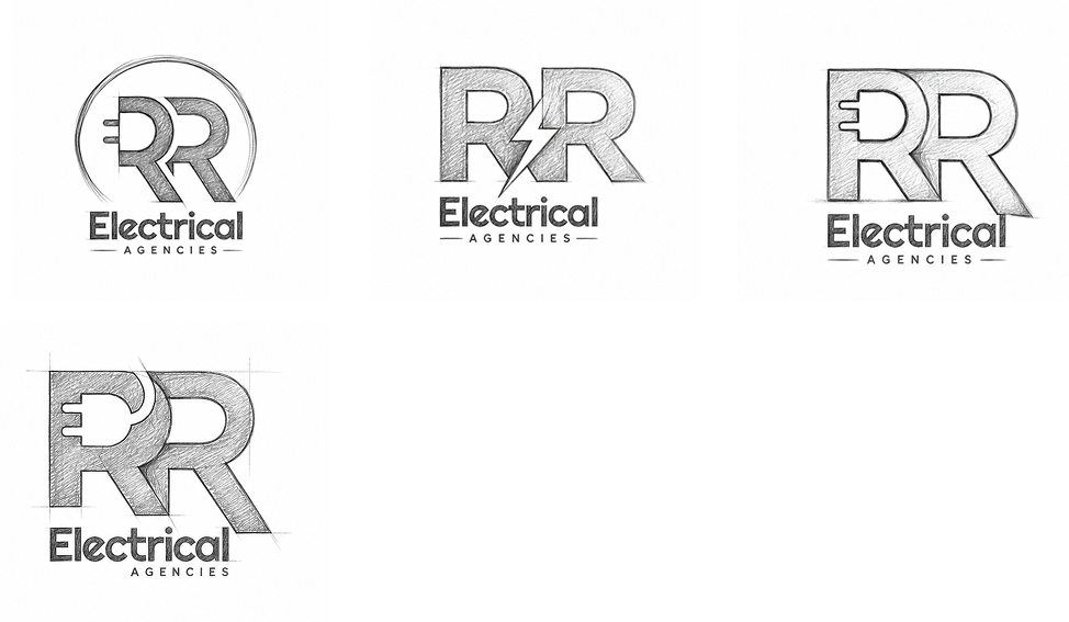
The early concept process explored multiple interpretations of electrical connection and the RR initials through hand sketches, rapid symbol studies and structural letterform experiments.
Initial directions investigated separate plug icons, cable-inspired letterforms, electrical pathways, mirrored R constructions and negative-space symbols. Typography was explored alongside the symbol to understand how a strong geometric monogram could balance with a readable service descriptor.
Repeated iteration focused on the relationship between the two R forms, the size of the plug, the curve of the letter bowls, diagonal leg angles and the overall vertical hierarchy of the lockup.
The strongest direction emerged when the plug was no longer treated as an external electrical icon and instead became part of the first R itself.
From there, the concept was refined around proportion, visual balance and immediate recognition.
From Sketch To Screen
The selected RR concept was rebuilt digitally with careful attention to shape, proportion and visual weight.
The plug silhouette was simplified for clarity, while the R forms were adjusted to create a stronger relationship between the curves, vertical stems and diagonal legs. Alignment and spacing were refined to ensure the symbol remained balanced above the supporting typography.
Every element was tested for scalability, readability and silhouette recognition.
The final result maintains the directness of the original sketch while creating a more distinctive and controlled brand mark.

The Symbol
The RR symbol begins with two initials, but its real story happens at the point of connection.A plug enters the first R, turning a familiar letter into an active electrical form. The negative space feels charged—as though power has just entered the identity and is beginning to travel through the structure.
From this connection, the monogram expands into two bold R forms. Their broad geometry communicates stability, while the diagonal legs create movement and direction. The shift from bright red to deep red reinforces the sense of energy passing from one form into the next.Strategically, the symbol connects the brand name directly with its industry. There is no need for an additional badge or generic electrical icon. The service is embedded into the initials.
Its simple silhouette makes the symbol memorable at a glance and flexible across vehicle graphics, workwear, signage, equipment labels and digital avatars.
The RR is not simply marked with electricity. It is visually powered by it.

Typography

Colors
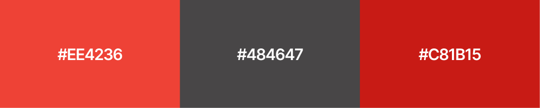
The RR palette is built around energy and control.
Bright electrical red introduces urgency and visibility, while the deeper power red creates strength and visual depth. Technical graphite grounds the identity with a professional, service-led tone, and white provides the contrast required to reveal the plug symbol.
Together, the colours create a palette that is highly recognisable, practical for the electrical service category and strong across both large-scale physical branding and compact digital communication.
Real world Mock-ups
A service identity only becomes complete when it performs in the environments where customers actually encounter the brand.
For RR Electrical Agencies, the logo must remain clear from the side of a moving vehicle, visible on workwear, recognisable on technical documents and consistent across digital service touchpoints.
Real-world testing allows the relationship between the bold monogram, plug negative space and supporting typography to be evaluated at multiple scales. It also ensures that the two red tones remain effective across print, fabric, vinyl, signage and screen-based applications.
The mockup system should focus on practical electrical environments rather than purely decorative brand presentation—showing RR as an active, professional and dependable service identity.


Turn ideas like this into your next project
.jpg)
Intro
Prodigilabs operates in a space where ideas, intelligence and technology are expected to move quickly from possibility to practical value. The identity needed to communicate more than technical capability; it had to make innovation feel active, accessible and purposeful.
The central challenge was creating a visual system that could balance multiple qualities at once: intelligence without complexity, technology without coldness, and progress without losing a sense of human imagination. As the brand moves across digital platforms, product experiences, presentations, innovation programmes and professional communication, it requires an identity that remains clear, recognisable and energetic at every scale.
The resulting direction connects the language of the mind, the light bulb and engineered systems into one visual story — transforming ideas into life.
Brand Brief
Personality
Prodigilabs has the curiosity of an experimental lab and the confidence of a modern technology partner. Its personality is forward-thinking without becoming distant, energetic without becoming playful, and technical without becoming visually complicated.
Vision of the Business
To create an environment where intelligent ideas can be explored, developed and transformed into meaningful solutions.
The larger ambition of Prodigilabs is to connect imagination with execution — helping ideas move beyond thought and become useful products, systems and experiences.
Target Audience
Prodigilabs is positioned for startups, growing businesses, innovation teams, technology-led organisations, entrepreneurs and decision-makers seeking a modern partner capable of translating ideas into practical digital or technology-driven outcomes.
The identity also speaks to young professionals and future-focused teams who value experimentation, smart thinking and responsible innovation.
USP
A thinking-to-building mindset that connects intelligent ideas with practical technological execution.
Logo Type
The Prodigilabs identity combines a distinctive brain-and-light-bulb symbol with a bold wordmark and supporting tagline. This classification suits the brand because the symbol can establish instant visual recognition, while the name clearly communicates the organisation behind the idea.
Together, they create a flexible system capable of working as a complete corporate signature or as a standalone digital icon.
Tagline
Think. Build. Bring Ideas to Life.
Key USPs
1. Intelligence With Application
Prodigilabs positions ideas as the beginning, not the final outcome. Intelligent thinking is connected to practical development, giving the brand a clear action-oriented purpose.
2. Innovation With Human Energy
The identity avoids the cold visual language often associated with technology. Organic curves, bright colours and familiar visual metaphors make innovation feel approachable and alive.
3. Progress With Purpose
The integration of technology and growth cues suggests a brand interested in forward movement that is thoughtful, efficient and conscious of long-term value.
The Vision
The central brand idea is intelligence activated.Prodigilabs should feel like the moment a thought gains energy and begins becoming something real. The identity communicates curiosity, optimism and momentum — creating a visual bridge between the abstract world of ideas and the structured world of technology.
The logo needed to immediately establish an innovation-led personality while remaining approachable enough to support communication with founders, businesses and multidisciplinary teams. Bold typography gives the brand confidence. Bright blue and green establish energy and progress. The brain-light symbol turns complex strategic thinking into a simple visual story.
Every element is directed toward one creative vision:
Make intelligence visible. Make innovation feel alive.

Usage Guide
Clear Space
The minimum clear space around the Prodigilabs logo is defined as X, where X equals the width of the central white vertical division within the brain-light bulb symbol.
A minimum distance of 2X should be maintained on every side of the complete logo lockup. This protected area allows the detailed symbol, bold wordmark and tagline to remain visually independent and immediately readable.
No text, graphics, images or other visual elements should enter this protected area.
Visual demonstration suggestion: Isolate the white central division of the brain symbol as a small rectangular measurement unit marked X. Repeat this unit twice around the outer boundary of the full logo and use thin blue construction lines to show the protected zone.
Positioning Map
The technology and innovation category often sits between two extremes. Traditional technology providers communicate structure and technical capability but can appear rigid. New digital challengers communicate energy and innovation but sometimes lack the visual confidence required for long-term business relationships.
Prodigilabs occupies the open space between human intelligence and progressive innovation. Its identity is structured enough to feel capable, while the bright palette and symbolic storytelling give it an energetic, idea-led personality.
The strategic opportunity is to position Prodigilabs as a human-centred innovation brand with strong technological confidence.

1. Intelligence becomes Possibility
The brief asked for : A visual idea that could immediately communicate intelligent thinking without relying on complicated technological imagery.
The decision : Use the universally understood structure of a brain as the foundation of the brand symbol, simplifying its organic pathways into a clean linear graphic.
Where you see it : The upper half of the standalone icon forms a stylised brain, with rounded interconnected lines representing thought, knowledge and the movement of ideas.
2. Ideas become Energy
The brief asked for : A symbol that could make innovation feel active rather than theoretical.
The decision : Transform the brain structure into the silhouette of a light bulb — connecting thought directly with the familiar visual language of ideas and discovery.
Where you see it : The brain flows vertically into the bulb base. The blue light detail above the letter i reinforces the same moment of activation within the wordmark.
3. Technology becomes Progress
The brief asked for : A technology-led personality that could communicate building, development and practical execution.
The decision : Introduce engineered geometry and a gear form into the wordmark to balance the organic intelligence of the brain with the precision of technological systems.
Where you see it : The blue gear embedded within the green g becomes a visual representation of ideas entering a working system — thought translated into process.
4. Growth becomes Purpose
The brief asked for : A future-focused visual layer that could express responsible advancement and positive development.
The decision : Integrate a subtle leaf motif into the typography, allowing growth to become part of the brand rather than an unrelated decorative element.
Where you see it : The green leaf forms rise from the letter structure within the wordmark, visually connecting technology with development, renewal and forward movement.
Concept Draw
The early concept process explored multiple interpretations of intelligence, invention and technological progress through rapid hand sketches and structural studies. Initial directions investigated complete light bulbs, neural pathways, brain silhouettes, circuit systems, gears, growth symbols and abstract monograms.Typography was explored alongside the symbol to understand how a bold geometric word structure could balance the more organic movement of the brain. Repeated iterations focused on the transition from brain to bulb, symmetry, line weight, bulb-base construction and the relationship between the icon and wordmark.
Further composition studies explored ways to embed secondary innovation cues directly into the lettering rather than surrounding the logo with additional graphics. The strongest direction emerged when the brain, light bulb, gear and growth cues began functioning as parts of one connected visual language.
The selected concept was refined through proportion, hierarchy and visual simplification until every element contributed to the same central story: thinking, activating and building.
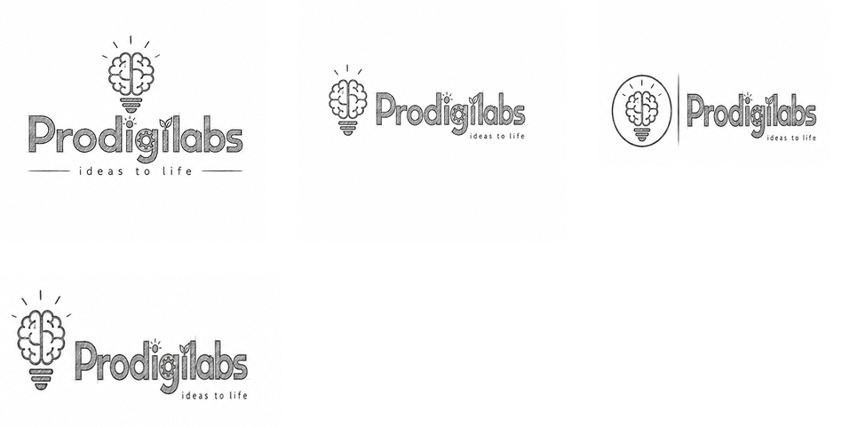
From Sketch To Screen
The selected concept moved into digital refinement with a focus on simplifying the brain pathways, controlling line weight and creating a balanced central division between blue and green. The bulb base was adjusted to maintain visual stability at smaller sizes, while the wordmark was refined around bold proportions and consistent visual rhythm.
Typography, symbol alignment and internal graphic details were carefully balanced to preserve readability. The final structure gives Prodigilabs a distinctive identity that remains recognisable across digital icons, large-scale signage and professional communication.
The Symbol
The Prodigilabs symbol begins with a brain, but its story is about what happens next.
Two coloured halves form a single intelligent structure. Blue brings focus, logic and technical confidence. Green introduces curiosity, growth and possibility. At the centre, a strong vertical division creates balance between these two ways of thinking.
As the brain moves downward, it becomes a light bulb.
The transformation is deliberate. A thought is not shown as something static or contained within the mind. It is given a source of energy, a structure and a visible outcome. The familiar light bulb form makes the symbol instantly approachable, while the brain pathways create enough distinction to make the idea specific to Prodigilabs.
Its rounded geometry gives the identity a human quality. The symmetry creates stability. The continuous visual movement from brain to bulb tells the brand story without requiring explanation.
At large scale, the neural details communicate intelligence. At smaller scale, the overall light bulb silhouette remains memorable. This allows the symbol to work across application icons, profile images, merchandise, presentation graphics, office environments and digital products.
It is a symbol of the moment when thinking becomes making.

Typography
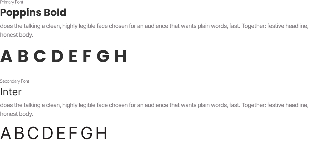
Colors

The Prodigilabs color palette is built around the relationship between intelligence and growth. Blue establishes technological confidence, while bright green injects momentum and possibility. Cyan adds a more exploratory layer to the brain symbol, and neutral grey supports information without competing with the primary identity.
Together, the colors create a high-contrast, energetic system suited to digital environments and innovation-led communication. The palette feels optimistic and accessible while retaining enough professional structure to support corporate and product-facing applications.
Real world Mock-ups
A technology identity must prove itself beyond a flat logo presentation. For Prodigilabs, real-world testing is especially important because the identity contains multiple levels of recognition: the detailed brain-light symbol, the bold wordmark and smaller embedded innovation cues.
Mock-ups should demonstrate how these elements maintain clarity at different scales and across varied customer touchpoints. Physical applications establish the brand as a tangible organization, while digital environments allow the color, symbol and idea-led graphic system to become more dynamic.
Consistency across these environments builds recognition and ensures that Prodigilabs feels like one connected innovation ecosystem rather than a collection of separate branded materials.


Turn ideas like this into your next project

Intro
Go Live in 25 is positioned as a bold growth-led platform built around vision, action and forward momentum. The identity challenge was to create a visual language that could carry the confidence of a movement without losing the direct, personal energy of a coaching and development brand.
The brand needed more than a motivational aesthetic. It required a recognisable system capable of moving between digital content, live sessions, community touchpoints, presentations, campaigns and physical brand applications. At the centre of the challenge was a simple question: how can an identity make ambition feel active?
The solution is a high-contrast visual system led by an interlocking GO monogram, an electric green signal colour and an oversized typographic voice. Every element is designed to feel immediate, energetic and ready to move—turning the existing idea of “big vision, bold action” into a distinct visual attitude.
Brand Brief
Personality
Go Live in 25 speaks with confidence rather than complexity. The brand is visually loud when it needs attention, but remains controlled through clean geometry and minimal composition. Its personality combines the momentum of a modern growth platform with the clarity of a focused personal development brand.
Vision of the Business
To create a growth-focused environment where vision is transformed into deliberate action. The larger ambition is to become a recognisable platform for people who are ready to move beyond planning, step into visibility and actively build the next stage of their personal or professional journey.
Target Audience
Ambitious entrepreneurs, emerging leaders, creators, independent professionals and growth-minded individuals who are actively seeking clarity, momentum and meaningful personal progress.
The audience values motivation, but responds more strongly to structure, action and visible forward movement.
USP
Rather than positioning personal development as passive inspiration, Go Live in 25 presents growth as something active, immediate and lived.
Logo Type
Combination Mark with Custom MonogramThe identity combines a distinctive GO symbol with a bold typographic wordmark. The monogram gives the brand a compact, recognisable visual asset, while the full lockup clearly communicates the brand name and core attitude.
This approach suits a modern growth platform because the symbol can independently lead digital avatars, merchandise and community assets, while the full logo remains strong in presentations, campaigns and branded communication.
Tagline
Big Vision. Bold Action.
Key USPs
1. Vision Made Actionable
Go Live in 25 shifts the conversation from simply imagining growth to actively pursuing it. The brand is centred on movement, decision and visible progress.
2. Built for Bold Momentum
The identity creates an energetic environment for people ready to take their next step. Its direct visual language reinforces confidence and forward movement at every touchpoint.
3. Growth Through Connection
The interlocking visual idea reflects a brand where ambition, community and action come together. Progress is positioned not as an isolated moment, but as part of a connected growth journey.
The Vision
The central vision was to create a brand that feels like the moment before action—the instant when an idea stops being a possibility and becomes a decision.Go Live in 25 needed to communicate energy without visual chaos, ambition without corporate distance and confidence without becoming aggressive. The identity therefore combines bold scale, controlled geometry and electric colour to create a feeling of immediate momentum.The logo acts as both a signature and a signal. Its compact monogram builds recognition, while the oversized typography creates a voice that is impossible to overlook. The identity supports the brand by giving its message of vision and action a visible form.
The creative direction: turn momentum into a visual language and make bold action impossible to ignore.

Usage Guide
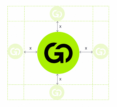
Clear Space
The minimum clear space around the Go Live in 25 logo is defined as X, where X equals the width of the vertical stem of the lowercase “l” in the word “live.”
A minimum distance of 1X should be maintained on every side of the complete logo lockup.
No text, graphics, images or other visual elements should enter this protected area. Maintaining this space preserves the logo's strong visual hierarchy, keeps the monogram clearly separated from surrounding content and protects the impact of the typographic composition.
Visual demonstration suggestion: isolate the vertical stem of the “l” as a small black rectangular measurement unit labelled X. Repeat the unit around all four sides of the complete logo and use thin construction lines to indicate the protected boundary.
Positioning Map
The personal growth and coaching category often sits between two visual extremes. At one end are traditional development brands built around formal, conservative and corporate communication. At the other are highly expressive motivational brands that depend heavily on inspirational language and temporary visual trends
.Go Live in 25 occupies a more distinctive position: boldly progressive and strongly action-led.
The identity feels modern and expressive, but its controlled geometry prevents it from becoming visually chaotic. It is designed for an audience that wants energy with direction—positioning the brand as a contemporary growth platform built around action rather than passive motivation.

1. Momentum becomes Confidence
The brief asked for : An identity that feels active, immediate and capable of pushing people toward their next move.
The decision : A bold typographic structure was selected to give the brand a strong visual voice. Large lowercase letterforms create scale and confidence, while the stacked composition makes the name feel direct and immediate.
Where you see it : In the oversized “live” and “in 25” typography, the compact line spacing and the strong black forms that dominate the visual hierarchy.
2. Connection becomes Belonging
The brief asked for : A recognisable symbol that could represent growth as a connected experience rather than an isolated journey.
The decision : The letters G and O were brought together into a single interlocking monogram. Their shared structure creates visual continuity and makes two individual forms feel like one connected unit.
Where you see it : In the custom GO symbol, where the circular letterforms overlap, meet and visually flow into one another.
3. Energy becomes Action
The brief asked for : A visual identity capable of communicating urgency and forward momentum without depending on complex graphics.
The decision : An electric green was introduced as the identity's primary signal colour. Rather than using multiple bright tones, one highly recognisable colour creates concentrated visual energy.
Where you see it : In the vivid green circular field behind the black GO monogram. The intense contrast immediately attracts attention and gives the symbol an active, digital-first presence.
4. Clarity becomes Direction
The brief asked for : A system that could communicate ambitious ideas in a simple, memorable and highly usable form.
The decision : The identity was reduced to essential elements: a monogram, a circle, bold black typography and one signal colour. The restraint gives every component a clear role and creates a scalable brand system.
Where you see it : In the minimal logo construction, limited colour palette, clean white space and clear hierarchy between the symbol, brand name and tagline.
Concept Draw
The early concept process explored multiple interpretations of GO, movement, growth and activation through rapid hand sketches and structural studies. Initial directions investigated standalone letterforms, arrows, pathways, forward-facing forms, linked circles and abstract movement symbols.
The G and O relationship became the central area of exploration. Sketches tested overlapping letters, continuous paths, negative-space connections and circular containers to understand how the brand name could become a compact visual signature.
Typography was explored alongside the symbol to establish the right balance between energy and clarity. Different stacked compositions, letter weights and logo structures were tested before the strongest direction emerged: a bold interlocking monogram supported by oversized lowercase typography.
Further iteration focused on circular proportion, letter overlap, internal negative space, alignment and hierarchy. The final direction was selected because it communicated connection and movement without adding unnecessary visual complexity.


From Sketch to Screen
The selected monogram was digitally refined by simplifying the curves, balancing the internal spaces and controlling the relationship between the G and O. Circular proportions were adjusted to improve recognition at smaller sizes, while the typography was aligned to create a stronger relationship between symbol and name.
Weight, spacing and scale were carefully tested to ensure the logo remained readable across digital and physical applications. The result is a distinctive mark that feels bold at large scale while retaining its recognisable silhouette in compact brand touchpoints.
The Symbol
The Go Live in 25 symbol begins with two letters, but its meaning lives in the moment they connect.
The G feels open and active—a form that has space to move, enter and continue. The O brings circularity, continuity and a sense of completion. Instead of allowing these letters to exist as separate initials, the symbol pulls them together. Their forms overlap until GO becomes a single visual action.
Placed inside an electric green circle, the monogram feels almost like an activation signal: a button, a pulse or a visual command to begin. This connection is central to the brand. Vision alone remains an idea. Action alone can lack direction. When the two meet, momentum begins.
The geometry gives the symbol strength and simplicity. Its circular silhouette is easy to recognise, highly adaptable and naturally suited to digital avatars, event graphics, merchandise, presentation covers and social content.
What makes the mark memorable is its directness. It does not illustrate growth literally. Instead, it captures the feeling of moving—GO is not simply read. It is felt as an instruction.

Typography

Colors

The Go Live in 25 colour system is deliberately concentrated. Electric green creates energy. Black creates authority. White creates clarity.
The palette feels digitally relevant, progressive and highly visible—qualities that support a modern personal growth and action-led platform. The extreme contrast strengthens recognition and allows the identity to move between bold event graphics, social communication and clean presentation systems without losing consistency.
Rather than depending on a broad decorative palette, the brand builds recognition through disciplined repetition of one distinctive signal colour.
Real world Mock-ups
The Go Live in 25 identity should be tested where the brand actually creates momentum: on screens, in live environments and across community touchpoints.
Real-world applications reveal whether the GO monogram remains recognisable at small scale, whether the electric green maintains sufficient impact in large-format communication and whether the bold typography creates a consistent visual voice across different content types.
The identity should move naturally between physical and digital environments. From a small social media profile icon to an oversized stage screen, every application should reinforce the same feeling of energy, clarity and forward action.

Turn ideas like this into your next project
Intro
Vedhaa’s Silks needed an identity capable of carrying the visual richness of silk without becoming ornamental for ornament's sake. In a category filled with traditional motifs, decorative typography and familiar cultural symbols, the challenge was to build a brand presence that felt rooted in heritage yet immediately ownable.
The identity needed to hold its elegance across saree packaging, textile labels, shopping bags, storefront communication and digital platforms. The central challenge was clear: translate the movement, prestige and ceremonial beauty associated with silk into a strong visual signature that customers could recognise before reading the name.
The result is a brand system where the peacock becomes more than decoration—it becomes the visual embodiment of silk itself.
Brand Brief
Personality
Regal, graceful, expressive, traditional, feminine and refined.
Vedhaa’s Silks carries the confidence of ceremonial luxury while remaining emotionally connected to the beauty of Indian textile culture.
Vision of the Business
To build a distinctive silk brand where every customer touchpoint celebrates the elegance, movement and cultural significance of traditional draping.
Target Audience
Women and families seeking silk sarees and traditional garments for weddings, celebrations, ceremonies and meaningful occasions.
The identity particularly speaks to customers who value cultural beauty, visual richness and a premium presentation experience.
USP
Silk elegance expressed through a distinctive peacock-led brand experience.
Logo Type
The identity combines a self-contained peacock emblem with an elegant serif wordmark. This structure gives Vedhaa’s Silks both visual recognition and name clarity.
The emblem can independently appear on labels, packaging seals and social media, while the complete lockup creates a formal and established retail presence.
Tagline
Grace in Every Drape
Key USPs
1. Occasion-Led Elegance
The brand is positioned around meaningful moments where silk becomes part of celebration, memory and personal expression.
2. A Distinctive Silk Signature
The peacock-inspired identity creates a recognisable visual language that separates Vedhaa’s Silks from conventional textile branding.
3. Tradition with Premium Presence
Cultural cues are presented through controlled composition, rich colour and refined detailing, giving traditional silk a more elevated brand experience.
The Vision
The creative vision was to make silk visible before it was touched.
The identity needed to communicate softness, movement and ceremonial grandeur while creating the confidence expected from a premium textile brand. Rather than illustrating a saree directly, the visual direction translates the natural flow of fabric into the layered feathers of a peacock.
Gold brings richness. Deep red brings celebration. The serif typography creates poise and heritage.
Every element works toward one central idea: to turn the grace of silk into a visual signature.
Usage Guide
Clear Space
The minimum clear space around the Vedhaa’s Silks logo is defined as X, where X equals the width of the gold outer border of the peacock emblem multiplied by four.
A minimum distance of 1X should be maintained on every side of the complete logo lockup.
No text, graphics, images or other visual elements should enter this protected area.
For the case study, isolate the border-based measurement as a small gold rectangular unit marked X, then repeat the same unit around the outer edges of the logo to visually demonstrate the protected space.
Positioning Map
The traditional silk category often moves between two extremes: highly conventional heritage retailers and visually modern fashion brands that reduce cultural character in favour of minimalism.
Vedhaa’s Silks occupies a more expressive premium position. It preserves recognisable Indian cultural cues while giving them a polished, brand-led presence.
The opportunity sits where Heritage meets Expressive Luxury.
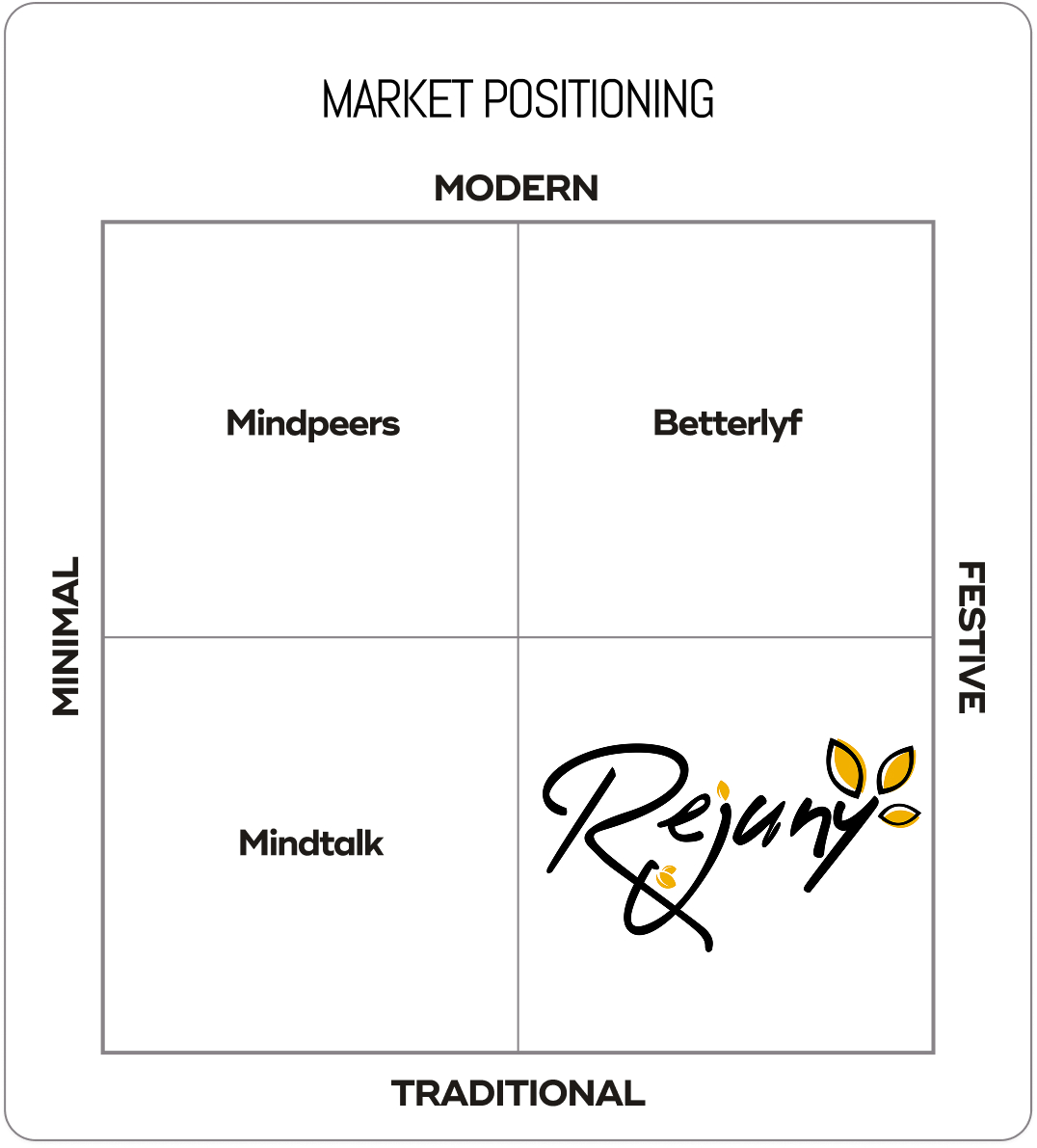
1. Grace becomes Movement
The brief asked for : A visual identity that could communicate the flowing elegance associated with silk.
The decision : The peacock's lower form was constructed using repeated sweeping curves that visually behave like layered folds of fabric.
Where you see it : The descending gold feather forms move outward and downward, creating the impression of a silk saree opening into a graceful drape.
2. Heritage becomes Prestige
The brief asked for : A traditional identity that felt elevated rather than visually old-fashioned.
The decision : Familiar cultural cues were paired with a controlled emblem structure, metallic gold treatment and high-contrast serif typography.
Where you see it : The peacock, deep ceremonial red and gold detailing establish heritage, while the refined rectangular frame gives the symbol a formal premium presence.
3. Beauty becomes Recognition
The brief asked for : A memorable brand symbol capable of becoming identifiable independently from the wordmark.
The decision : The peacock was simplified into one dominant silhouette with a distinctive curved neck and layered tail structure.
Where you see it : The negative space around the peacock's neck, the eye detail and the flowing feather construction create a recognisable visual signature.
4. Celebration becomes Colour
The brief asked for : A colour language that could express the emotional richness of traditional silk occasions.
The decision : A deep red and luminous gold palette was used to create immediate associations with ceremony, richness and festive elegance.
Where you see it : Red anchors the emblem and wordmark, while layered gold moves across the peacock, border and ornamental flourishes.
Concept Draw
The early concept process explored multiple interpretations of silk, movement and the peacock form through hand sketches and rapid structural studies. Initial directions investigated complete birds, abstract feather systems, fabric folds, traditional frames and monogram-led compositions.
Typography was explored alongside the symbol to understand how a formal serif structure could balance the organic movement of the peacock. Repeated iteration focused on proportion, neck curvature, feather rhythm, emblem dimensions and hierarchy between symbol and name.
The strongest direction emerged when the peacock's tail began to behave like draped silk. This visual connection created the most meaningful balance between product, culture and brand recognition and became the foundation for digital refinement.

From Sketch to Screen
The selected concept moved into digital refinement through careful simplification of the peacock silhouette and repeated adjustment of the feather curves.
The body-to-tail proportion was balanced to create a stronger vertical structure, while the emblem frame established consistent alignment. Typography was refined to complement the symbol without competing with its detail.
Scalability, readability and distinctiveness guided each adjustment, resulting in a mark that retains its character across both complete logo lockups and symbol-led applications.

The Symbol
The Vedhaa’s symbol begins with a peacock, but its story ends in silk.
The bird rises with a quiet, poised curve before its body opens into layers of flowing gold. These layers feel less like individual feathers and more like fabric falling into carefully arranged pleats. The transformation connects the natural grace of the peacock with the movement of a silk saree.
The rectangular red frame gives this movement a place of importance. It turns the bird into an emblem—something presented, remembered and repeated.
Strategically, the symbol brings product and emotion together. Silk is represented through flow. Celebration is carried through red. Premium character is expressed through gold.
Its distinctive silhouette allows the emblem to live independently on woven labels, boxes, seals, bags and digital icons, giving Vedhaa’s Silks a recognisable signature beyond the full wordmark.
.jpg)
Typography
Colors

The MANAM palette creates an atmosphere of depth, warmth, and quiet sophistication. Deep plum establishes an introspective emotional environment, while muted gold introduces warmth, value, and inner illumination. White provides clarity and breathing space.
Real world Mock-ups
The identity should be tested where customers actually experience silk—from the first storefront impression to the final unboxing of a saree.
Real-world applications reveal whether the emblem maintains clarity at small scales, whether the gold treatment remains consistent across materials and whether the brand is recognisable across physical and digital touchpoints.
A consistent application system allows the peacock emblem to become a repeated signature, strengthening recognition at every stage of the customer journey.


Turn ideas like this into your next project

Intro
MANAM needed an identity capable of expressing something deeply personal without becoming visually complicated. Positioned around the idea of finding one's voice from within, the brand required a visual system that could feel calm, intimate, credible, and quietly empowering.
The challenge was to translate an invisible inner journey into a distinctive visual language. The identity needed to communicate reflection and personal expression while remaining professional enough for coaching, workshops, digital platforms, guided programmes, and intimate one-to-one experiences.
The result is a brand system centred on inner connection — where structured geometry, flowing lines, and a restrained premium palette create a visual voice that feels considered, human, and emotionally resonant.
Brand Brief
Personality
MANAM speaks with quiet confidence. It does not demand attention; it creates space for people to listen, reflect, and express themselves authentically.
Vision of the Business
To create a trusted space where individuals can reconnect with their inner voice, develop confidence in self-expression, and communicate from a place of greater clarity and awareness.
Target Audience
Thoughtful individuals, emerging professionals, creatives, leaders, and personal-growth seekers who want to strengthen their voice, confidence, communication, and connection with themselves.
USP
An inside-out approach to authentic expression — helping people discover their voice before teaching them how to project it.
Logo Type
The identity combines a distinctive linear symbol with a spacious MANAM wordmark. The symbol carries the emotional and conceptual story, while the wordmark gives the brand clarity and authority.
This structure allows MANAM to move between expressive storytelling and minimal professional communication.
Tagline
Find Your Voice From Within
Key USPs
1. Corporate Precision
MANAM begins with self-awareness, helping expression emerge from genuine internal clarity rather than surface-level performance.
2. Elevated Event Presence
The brand connects voice with purpose, encouraging communication that feels considered, confident, and personally meaningful.
3. Excellence Through Execution
MANAM positions development as a reflective journey, creating an experience that feels supportive, premium, and deeply human.
The Vision
The central idea behind MANAM is simple: the strongest voice begins within.
The identity needed to communicate a sense of inner stillness gradually becoming visible expression. Rather than using obvious symbols of speech or communication, the visual direction explores connection, rhythm, repetition, and centred form.
The logo needed to feel personal without appearing informal, spiritual without becoming mystical, and premium without creating emotional distance.
Flowing gold lines introduce warmth and movement, while the deep plum environment creates introspection and depth. The balanced composition reinforces calm and intentionality.
The creative direction turns inner awareness into a visible, confident form.

Usage Guide
Clear Space
The minimum clear space around the MANAM logo is defined as X, where X equals the diameter of the circular form positioned above the central symbol.
A minimum distance of 1X should be maintained on every side of the complete logo lockup.
No text, graphics, images, borders, or other visual elements should enter this protected area.
For the case study, demonstrate the rule by placing a measurement circle marked X beside the logo and repeating the same circular unit around the outer logo boundary using subtle construction lines.
Positioning Map
The personal-development and communication space often sits between two extremes: highly corporate performance coaching and overtly spiritual self-discovery.
MANAM occupies the open space between these worlds. It feels emotionally aware and human while maintaining the visual discipline of a premium contemporary brand.

1. Innerness becomes Presence
The brief asked for : A brand identity that could communicate personal discovery without relying on predictable self-help imagery.
The decision : Build the symbol from inward-facing, repeated linear forms that visually draw attention toward a central core.
Where you see it : The mirrored curves of the symbol move inward and meet around the central vertical structure, creating a visual sense of focus and internal alignment.
2. Voice becomes Rhythm
The brief asked for :A visual connection to expression that feels subtle, intelligent, and ownable.
The decision : Translate the rhythm of voice into repeated vertical curves rather than using literal microphones, speech bubbles, or sound icons.
Where you see it : The symbol's continuous gold lines create a waveform-like repetition, suggesting resonance, breath, and a voice moving through space.
3. Vulnerability becomes Confidence
The brief asked for : An identity that feels emotionally open while still carrying professional authority.
The decision : Balance soft rounded geometry with a highly controlled, symmetrical composition.
Where you see it : The curved symbol creates warmth and approachability, while its central alignment, repeated proportions, and structured wordmark create visual confidence.
4. Stillness becomes Clarity
The brief asked for : A visual system that creates space for reflection and focused communication.
The decision : Use restrained colour, generous negative space, and minimal visual elements to remove unnecessary noise.
Where you see it : The isolated symbol, wide letter spacing, centred lockup, and deep plum background give every element room to breathe.
Concept Draw
The early concept stage explored multiple ways to transform voice, self-awareness, and inner connection into a distinctive visual form. Hand sketches tested sound waves, mirrored human forms, abstract letter structures, centred pathways, and continuous line symbols.
Typography and symbol compositions were explored simultaneously to understand how the emotional softness of the mark could balance with a refined wordmark. Repeated iterations focused on curve tension, line rhythm, proportion, hierarchy, and the relationship between the upper circular detail and the central structure.
The strongest direction emerged when the symbol stopped illustrating voice literally and began feeling like voice visually. From there, the form was simplified and refined to achieve greater harmony and recognition.
.png)
From Sketch to Screen
The selected concept was digitally reconstructed using consistent line weights, controlled curves, and mirrored geometry.
Proportions were adjusted to strengthen the relationship between the central form and outer arches. Typography was spaced to complement the symbol's openness, while alignment and scale tests ensured the complete mark remained readable and distinctive across large and small applications.
The final refinement created a symbol that feels simple at first glance but reveals deeper meaning through its structure

The Symbol
The MANAM symbol feels like a voice before it becomes a word.
Its repeating curves rise and return in a quiet rhythm, suggesting breath, resonance, and thoughts moving from an internal space toward expression. The central structure creates a point of focus — an inner core held between mirrored forms.
At another level, the symbol can be seen as two human presences facing inward, connected through a shared centre. The small circle above introduces a sense of awareness: a thought, a conscious self, or the moment of recognition that happens before expression.
Its geometry gives the brand stability, while the uninterrupted linear rhythm keeps the symbol emotionally fluid.
Compact, distinctive, and independent from the wordmark, the symbol can become a recognisable brand signature across digital interfaces, printed materials, spaces, and intimate customer touchpoints.
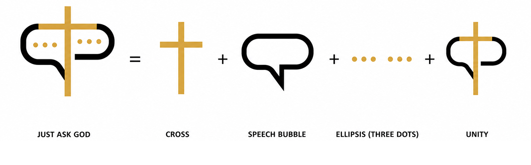
Typography

Colors

The MANAM palette creates an atmosphere of depth, warmth, and quiet sophistication. Deep plum establishes an introspective emotional environment, while muted gold introduces warmth, value, and inner illumination. White provides clarity and breathing space.
Real world Mock-ups
The identity should be tested where customers actually experience silk—from the first storefront impression to the final unboxing of a saree.
Real-world applications reveal whether the emblem maintains clarity at small scales, whether the gold treatment remains consistent across materials and whether the brand is recognisable across physical and digital touchpoints.
A consistent application system allows the peacock emblem to become a repeated signature, strengthening recognition at every stage of the customer journey.
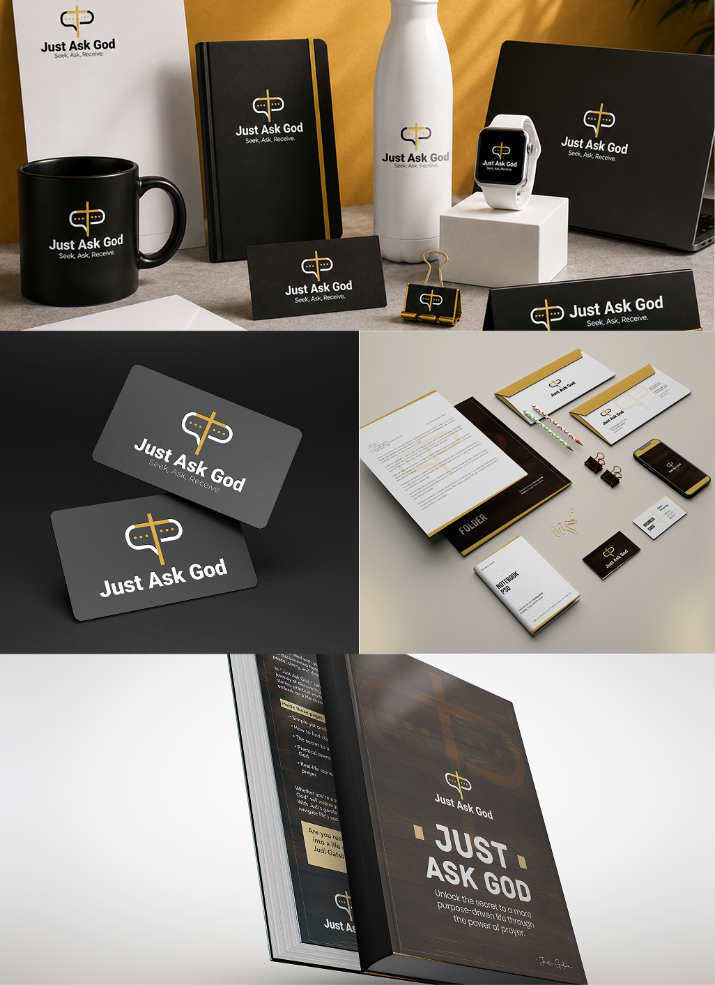
.jpg)
Turn ideas like this into your next project
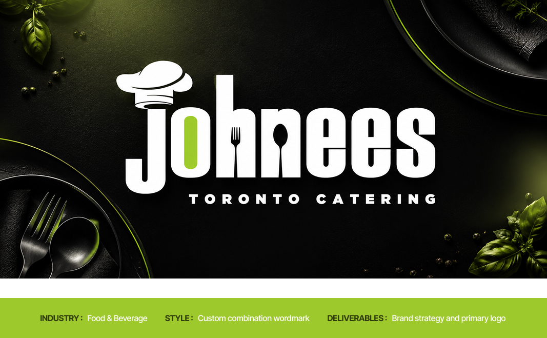
Intro
Vedhaa’s Silks needed an identity capable of carrying the visual richness of silk without becoming ornamental for ornament's sake. In a category filled with traditional motifs, decorative typography and familiar cultural symbols, the challenge was to build a brand presence that felt rooted in heritage yet immediately ownable.
The identity needed to hold its elegance across saree packaging, textile labels, shopping bags, storefront communication and digital platforms. The central challenge was clear: translate the movement, prestige and ceremonial beauty associated with silk into a strong visual signature that customers could recognise before reading the name.
The result is a brand system where the peacock becomes more than decoration—it becomes the visual embodiment of silk itself.
Brand Brief
Personality
Regal, graceful, expressive, traditional, feminine and refined.
Vedhaa’s Silks carries the confidence of ceremonial luxury while remaining emotionally connected to the beauty of Indian textile culture.
Vision of the Business
To build a distinctive silk brand where every customer touchpoint celebrates the elegance, movement and cultural significance of traditional draping.
Target Audience
Women and families seeking silk sarees and traditional garments for weddings, celebrations, ceremonies and meaningful occasions.
The identity particularly speaks to customers who value cultural beauty, visual richness and a premium presentation experience.
USP
Silk elegance expressed through a distinctive peacock-led brand experience.
Logo Type
The identity combines a self-contained peacock emblem with an elegant serif wordmark. This structure gives Vedhaa’s Silks both visual recognition and name clarity.
The emblem can independently appear on labels, packaging seals and social media, while the complete lockup creates a formal and established retail presence.
Tagline
Grace in Every Drape
Key USPs
1. Occasion-Led Elegance
The brand is positioned around meaningful moments where silk becomes part of celebration, memory and personal expression.
2. A Distinctive Silk Signature
The peacock-inspired identity creates a recognisable visual language that separates Vedhaa’s Silks from conventional textile branding.
3. Tradition with Premium Presence
Cultural cues are presented through controlled composition, rich colour and refined detailing, giving traditional silk a more elevated brand experience.
The Vision
The creative vision was to make silk visible before it was touched.
The identity needed to communicate softness, movement and ceremonial grandeur while creating the confidence expected from a premium textile brand. Rather than illustrating a saree directly, the visual direction translates the natural flow of fabric into the layered feathers of a peacock.
Gold brings richness. Deep red brings celebration. The serif typography creates poise and heritage.
Every element works toward one central idea: to turn the grace of silk into a visual signature.

Usage Guide

Clear Space
The minimum clear space around the Vedhaa’s Silks logo is defined as X, where X equals the width of the gold outer border of the peacock emblem multiplied by four.
A minimum distance of 1X should be maintained on every side of the complete logo lockup.
No text, graphics, images or other visual elements should enter this protected area.
For the case study, isolate the border-based measurement as a small gold rectangular unit marked X, then repeat the same unit around the outer edges of the logo to visually demonstrate the protected space.
Positioning Map
The traditional silk category often moves between two extremes: highly conventional heritage retailers and visually modern fashion brands that reduce cultural character in favour of minimalism.
Vedhaa’s Silks occupies a more expressive premium position. It preserves recognisable Indian cultural cues while giving them a polished, brand-led presence.
The opportunity sits where Heritage meets Expressive Luxury.

1. Grace becomes Movement
The brief asked for : A visual identity that could communicate the flowing elegance associated with silk.
The decision : The peacock's lower form was constructed using repeated sweeping curves that visually behave like layered folds of fabric.
Where you see it : The descending gold feather forms move outward and downward, creating the impression of a silk saree opening into a graceful drape.
2. Heritage becomes Prestige
The brief asked for : A traditional identity that felt elevated rather than visually old-fashioned.
The decision : Familiar cultural cues were paired with a controlled emblem structure, metallic gold treatment and high-contrast serif typography.
Where you see it : The peacock, deep ceremonial red and gold detailing establish heritage, while the refined rectangular frame gives the symbol a formal premium presence.
3. Beauty becomes Recognition
The brief asked for : A memorable brand symbol capable of becoming identifiable independently from the wordmark.
The decision : The peacock was simplified into one dominant silhouette with a distinctive curved neck and layered tail structure.
Where you see it : The negative space around the peacock's neck, the eye detail and the flowing feather construction create a recognisable visual signature.
4. Celebration becomes Colour
The brief asked for : A colour language that could express the emotional richness of traditional silk occasions.
The decision : A deep red and luminous gold palette was used to create immediate associations with ceremony, richness and festive elegance.
Where you see it : Red anchors the emblem and wordmark, while layered gold moves across the peacock, border and ornamental flourishes.
Concept Draw
The early concept process explored multiple interpretations of silk, movement and the peacock form through hand sketches and rapid structural studies. Initial directions investigated complete birds, abstract feather systems, fabric folds, traditional frames and monogram-led compositions.
Typography was explored alongside the symbol to understand how a formal serif structure could balance the organic movement of the peacock. Repeated iteration focused on proportion, neck curvature, feather rhythm, emblem dimensions and hierarchy between symbol and name.
The strongest direction emerged when the peacock's tail began to behave like draped silk. This visual connection created the most meaningful balance between product, culture and brand recognition and became the foundation for digital refinement.

From Sketch to Screen
The selected concept moved into digital refinement through careful simplification of the peacock silhouette and repeated adjustment of the feather curves.
The body-to-tail proportion was balanced to create a stronger vertical structure, while the emblem frame established consistent alignment. Typography was refined to complement the symbol without competing with its detail.
Scalability, readability and distinctiveness guided each adjustment, resulting in a mark that retains its character across both complete logo lockups and symbol-led applications.

The Symbol
The Vedhaa’s symbol begins with a peacock, but its story ends in silk.
The bird rises with a quiet, poised curve before its body opens into layers of flowing gold. These layers feel less like individual feathers and more like fabric falling into carefully arranged pleats. The transformation connects the natural grace of the peacock with the movement of a silk saree.
The rectangular red frame gives this movement a place of importance. It turns the bird into an emblem—something presented, remembered and repeated.
Strategically, the symbol brings product and emotion together. Silk is represented through flow. Celebration is carried through red. Premium character is expressed through gold.
Its distinctive silhouette allows the emblem to live independently on woven labels, boxes, seals, bags and digital icons, giving Vedhaa’s Silks a recognisable signature beyond the full wordmark.
.jpg)
Typography
Colors

A grounding neutral that intensifies the red and gold palette while creating a dramatic premium presentation environment.
The Vedhaa’s Silks palette is intentionally rich and ceremonial. Red creates emotional recognition, while layered gold tones capture the changing light and lustre of silk. Black provides contrast and visual depth. Together, the colours create an expressive premium system directly connected to the identity's traditional and occasion-led personality.
Real world Mock-ups
The identity should be tested where customers actually experience silk—from the first storefront impression to the final unboxing of a saree.
Real-world applications reveal whether the emblem maintains clarity at small scales, whether the gold treatment remains consistent across materials and whether the brand is recognisable across physical and digital touchpoints.
A consistent application system allows the peacock emblem to become a repeated signature, strengthening recognition at every stage of the customer journey.


Turn ideas like this into your next project
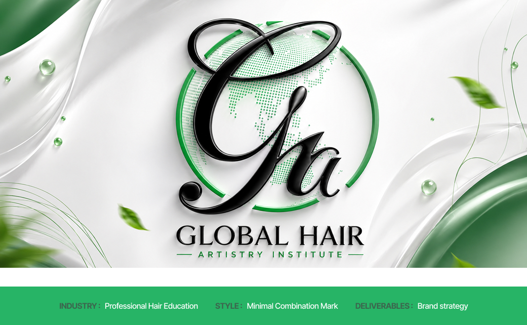
Intro
MANAM needed an identity capable of expressing something deeply personal without becoming visually complicated. Positioned around the idea of finding one's voice from within, the brand required a visual system that could feel calm, intimate, credible, and quietly empowering.
The challenge was to translate an invisible inner journey into a distinctive visual language. The identity needed to communicate reflection and personal expression while remaining professional enough for coaching, workshops, digital platforms, guided programmes, and intimate one-to-one experiences.
The result is a brand system centred on inner connection — where structured geometry, flowing lines, and a restrained premium palette create a visual voice that feels considered, human, and emotionally resonant.
Brand Brief
Personality
MANAM speaks with quiet confidence. It does not demand attention; it creates space for people to listen, reflect, and express themselves authentically.
Vision of the Business
To create a trusted space where individuals can reconnect with their inner voice, develop confidence in self-expression, and communicate from a place of greater clarity and awareness.
Target Audience
Thoughtful individuals, emerging professionals, creatives, leaders, and personal-growth seekers who want to strengthen their voice, confidence, communication, and connection with themselves.
USP
An inside-out approach to authentic expression — helping people discover their voice before teaching them how to project it.
Logo Type
The identity combines a distinctive linear symbol with a spacious MANAM wordmark. The symbol carries the emotional and conceptual story, while the wordmark gives the brand clarity and authority.
This structure allows MANAM to move between expressive storytelling and minimal professional communication.
Tagline
Find Your Voice From Within
Key USPs
1. Corporate Precision
MANAM begins with self-awareness, helping expression emerge from genuine internal clarity rather than surface-level performance.
2. Elevated Event Presence
The brand connects voice with purpose, encouraging communication that feels considered, confident, and personally meaningful.
3. Excellence Through Execution
MANAM positions development as a reflective journey, creating an experience that feels supportive, premium, and deeply human.
The Vision
The central idea behind MANAM is simple: the strongest voice begins within.
The identity needed to communicate a sense of inner stillness gradually becoming visible expression. Rather than using obvious symbols of speech or communication, the visual direction explores connection, rhythm, repetition, and centred form.
The logo needed to feel personal without appearing informal, spiritual without becoming mystical, and premium without creating emotional distance.
Flowing gold lines introduce warmth and movement, while the deep plum environment creates introspection and depth. The balanced composition reinforces calm and intentionality.
The creative direction turns inner awareness into a visible, confident form.

Usage Guide

Clear Space
The minimum clear space around the MANAM logo is defined as X, where X equals the diameter of the circular form positioned above the central symbol.
A minimum distance of 1X should be maintained on every side of the complete logo lockup.
No text, graphics, images, borders, or other visual elements should enter this protected area.
For the case study, demonstrate the rule by placing a measurement circle marked X beside the logo and repeating the same circular unit around the outer logo boundary using subtle construction lines.
Positioning Map
The personal-development and communication space often sits between two extremes: highly corporate performance coaching and overtly spiritual self-discovery.
MANAM occupies the open space between these worlds. It feels emotionally aware and human while maintaining the visual discipline of a premium contemporary brand.

1. Innerness becomes Presence
The brief asked for : A brand identity that could communicate personal discovery without relying on predictable self-help imagery.
The decision : Build the symbol from inward-facing, repeated linear forms that visually draw attention toward a central core.
Where you see it : The mirrored curves of the symbol move inward and meet around the central vertical structure, creating a visual sense of focus and internal alignment.
2. Voice becomes Rhythm
The brief asked for : A visual connection to expression that feels subtle, intelligent, and ownable.
The decision : Translate the rhythm of voice into repeated vertical curves rather than using literal microphones, speech bubbles, or sound icons.
Where you see it : The symbol's continuous gold lines create a waveform-like repetition, suggesting resonance, breath, and a voice moving through space.
3. Vulnerability becomes Confidence
The brief asked for : An identity that feels emotionally open while still carrying professional authority.
The decision : Balance soft rounded geometry with a highly controlled, symmetrical composition.
Where you see it : The curved symbol creates warmth and approachability, while its central alignment, repeated proportions, and structured wordmark create visual confidence.
4. Stillness becomes Clarity
The brief asked for : A visual system that creates space for reflection and focused communication.
The decision : Use restrained colour, generous negative space, and minimal visual elements to remove unnecessary noise.
Where you see it : The isolated symbol, wide letter spacing, centred lockup, and deep plum background give every element room to breathe.
Concept Draw
The early concept stage explored multiple ways to transform voice, self-awareness, and inner connection into a distinctive visual form. Hand sketches tested sound waves, mirrored human forms, abstract letter structures, centred pathways, and continuous line symbols.
Typography and symbol compositions were explored simultaneously to understand how the emotional softness of the mark could balance with a refined wordmark. Repeated iterations focused on curve tension, line rhythm, proportion, hierarchy, and the relationship between the upper circular detail and the central structure.
The strongest direction emerged when the symbol stopped illustrating voice literally and began feeling like voice visually. From there, the form was simplified and refined to achieve greater harmony and recognition.
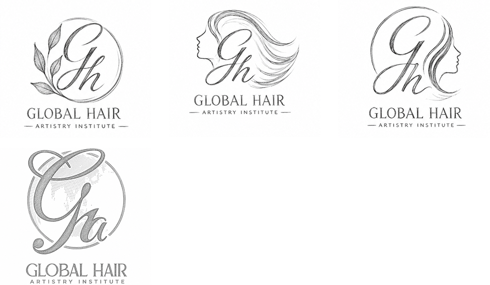
From Sketch to Screen
The selected concept was digitally reconstructed using consistent line weights, controlled curves, and mirrored geometry.
Proportions were adjusted to strengthen the relationship between the central form and outer arches. Typography was spaced to complement the symbol's openness, while alignment and scale tests ensured the complete mark remained readable and distinctive across large and small applications.
The final refinement created a symbol that feels simple at first glance but reveals deeper meaning through its structure

The Symbol
The MANAM symbol feels like a voice before it becomes a word.
Its repeating curves rise and return in a quiet rhythm, suggesting breath, resonance, and thoughts moving from an internal space toward expression. The central structure creates a point of focus — an inner core held between mirrored forms.
At another level, the symbol can be seen as two human presences facing inward, connected through a shared centre. The small circle above introduces a sense of awareness: a thought, a conscious self, or the moment of recognition that happens before expression.
Its geometry gives the brand stability, while the uninterrupted linear rhythm keeps the symbol emotionally fluid.
Compact, distinctive, and independent from the wordmark, the symbol can become a recognisable brand signature across digital interfaces, printed materials, spaces, and intimate customer touchpoints.

Typography
Colors

The MANAM palette creates an atmosphere of depth, warmth, and quiet sophistication. Deep plum establishes an introspective emotional environment, while muted gold introduces warmth, value, and inner illumination. White provides clarity and breathing space.
Real world Mock-ups
The identity should be tested where customers actually experience silk—from the first storefront impression to the final unboxing of a saree.
Real-world applications reveal whether the emblem maintains clarity at small scales, whether the gold treatment remains consistent across materials and whether the brand is recognisable across physical and digital touchpoints.
A consistent application system allows the peacock emblem to become a repeated signature, strengthening recognition at every stage of the customer journey.

Turn ideas like this into your next project

Intro
Vedhaa’s Silks needed an identity capable of carrying the visual richness of silk without becoming ornamental for ornament's sake. In a category filled with traditional motifs, decorative typography and familiar cultural symbols, the challenge was to build a brand presence that felt rooted in heritage yet immediately ownable.
The identity needed to hold its elegance across saree packaging, textile labels, shopping bags, storefront communication and digital platforms. The central challenge was clear: translate the movement, prestige and ceremonial beauty associated with silk into a strong visual signature that customers could recognise before reading the name.
The result is a brand system where the peacock becomes more than decoration—it becomes the visual embodiment of silk itself.
Brand Brief
Personality
Regal, graceful, expressive, traditional, feminine and refined.
Vedhaa’s Silks carries the confidence of ceremonial luxury while remaining emotionally connected to the beauty of Indian textile culture.
Vision of the Business
To build a distinctive silk brand where every customer touchpoint celebrates the elegance, movement and cultural significance of traditional draping.
Target Audience
Women and families seeking silk sarees and traditional garments for weddings, celebrations, ceremonies and meaningful occasions.
The identity particularly speaks to customers who value cultural beauty, visual richness and a premium presentation experience.
USP
Silk elegance expressed through a distinctive peacock-led brand experience.
Logo Type
The identity combines a self-contained peacock emblem with an elegant serif wordmark. This structure gives Vedhaa’s Silks both visual recognition and name clarity.
The emblem can independently appear on labels, packaging seals and social media, while the complete lockup creates a formal and established retail presence.
Tagline
Grace in Every Drape
The Vision
The creative vision was to make silk visible before it was touched.
The identity needed to communicate softness, movement and ceremonial grandeur while creating the confidence expected from a premium textile brand. Rather than illustrating a saree directly, the visual direction translates the natural flow of fabric into the layered feathers of a peacock.
Gold brings richness. Deep red brings celebration. The serif typography creates poise and heritage.
Every element works toward one central idea: to turn the grace of silk into a visual signature.

Usage Guide
Clear Space
The minimum clear space around the Vedhaa’s Silks logo is defined as X, where X equals the width of the gold outer border of the peacock emblem multiplied by four.
A minimum distance of 1X should be maintained on every side of the complete logo lockup.
No text, graphics, images or other visual elements should enter this protected area.
For the case study, isolate the border-based measurement as a small gold rectangular unit marked X, then repeat the same unit around the outer edges of the logo to visually demonstrate the protected space.
Positioning Map
The traditional silk category often moves between two extremes: highly conventional heritage retailers and visually modern fashion brands that reduce cultural character in favour of minimalism.
Vedhaa’s Silks occupies a more expressive premium position. It preserves recognisable Indian cultural cues while giving them a polished, brand-led presence.
The opportunity sits where Heritage meets Expressive Luxury.

1. Grace becomes Movement
The brief asked for : A visual identity that could communicate the flowing elegance associated with silk.
The decision : The peacock's lower form was constructed using repeated sweeping curves that visually behave like layered folds of fabric.
Where you see it : The descending gold feather forms move outward and downward, creating the impression of a silk saree opening into a graceful drape.
2. Heritage becomes Prestige
The brief asked for : A traditional identity that felt elevated rather than visually old-fashioned.
The decision : Familiar cultural cues were paired with a controlled emblem structure, metallic gold treatment and high-contrast serif typography.
Where you see it : The peacock, deep ceremonial red and gold detailing establish heritage, while the refined rectangular frame gives the symbol a formal premium presence.
3. Beauty becomes Recognition
The brief asked for : A memorable brand symbol capable of becoming identifiable independently from the wordmark.
The decision : The peacock was simplified into one dominant silhouette with a distinctive curved neck and layered tail structure.
Where you see it : The negative space around the peacock's neck, the eye detail and the flowing feather construction create a recognisable visual signature.
4. Celebration becomes Colour
The brief asked for : A colour language that could express the emotional richness of traditional silk occasions.
The decision : A deep red and luminous gold palette was used to create immediate associations with ceremony, richness and festive elegance.
Where you see it : Red anchors the emblem and wordmark, while layered gold moves across the peacock, border and ornamental flourishes.
Concept Draw
The early concept process explored multiple interpretations of silk, movement and the peacock form through hand sketches and rapid structural studies. Initial directions investigated complete birds, abstract feather systems, fabric folds, traditional frames and monogram-led compositions.
Typography was explored alongside the symbol to understand how a formal serif structure could balance the organic movement of the peacock. Repeated iteration focused on proportion, neck curvature, feather rhythm, emblem dimensions and hierarchy between symbol and name.
The strongest direction emerged when the peacock's tail began to behave like draped silk. This visual connection created the most meaningful balance between product, culture and brand recognition and became the foundation for digital refinement.

From Sketch to Screen
The selected concept moved into digital refinement through careful simplification of the peacock silhouette and repeated adjustment of the feather curves.
The body-to-tail proportion was balanced to create a stronger vertical structure, while the emblem frame established consistent alignment. Typography was refined to complement the symbol without competing with its detail.
Scalability, readability and distinctiveness guided each adjustment, resulting in a mark that retains its character across both complete logo lockups and symbol-led applications.

The Symbol
The Vedhaa’s symbol begins with a peacock, but its story ends in silk.
The bird rises with a quiet, poised curve before its body opens into layers of flowing gold. These layers feel less like individual feathers and more like fabric falling into carefully arranged pleats. The transformation connects the natural grace of the peacock with the movement of a silk saree.
The rectangular red frame gives this movement a place of importance. It turns the bird into an emblem—something presented, remembered and repeated.
Strategically, the symbol brings product and emotion together. Silk is represented through flow. Celebration is carried through red. Premium character is expressed through gold.
Its distinctive silhouette allows the emblem to live independently on woven labels, boxes, seals, bags and digital icons, giving Vedhaa’s Silks a recognisable signature beyond the full wordmark.
.jpg)
Typography
Colors

A grounding neutral that intensifies the red and gold palette while creating a dramatic premium presentation environment.
The Vedhaa’s Silks palette is intentionally rich and ceremonial. Red creates emotional recognition, while layered gold tones capture the changing light and lustre of silk. Black provides contrast and visual depth. Together, the colours create an expressive premium system directly connected to the identity's traditional and occasion-led personality.
Real world Mock-ups
The identity should be tested where customers actually experience silk—from the first storefront impression to the final unboxing of a saree.
Real-world applications reveal whether the emblem maintains clarity at small scales, whether the gold treatment remains consistent across materials and whether the brand is recognisable across physical and digital touchpoints.
A consistent application system allows the peacock emblem to become a repeated signature, strengthening recognition at every stage of the customer journey.


Turn ideas like this into your next project

Intro
Vedhaa’s Silks needed an identity capable of carrying the visual richness of silk without becoming ornamental for ornament's sake. In a category filled with traditional motifs, decorative typography and familiar cultural symbols, the challenge was to build a brand presence that felt rooted in heritage yet immediately ownable.
The identity needed to hold its elegance across saree packaging, textile labels, shopping bags, storefront communication and digital platforms. The central challenge was clear: translate the movement, prestige and ceremonial beauty associated with silk into a strong visual signature that customers could recognise before reading the name.
The result is a brand system where the peacock becomes more than decoration—it becomes the visual embodiment of silk itself.
Brand Brief
Personality
Regal, graceful, expressive, traditional, feminine and refined.
Vedhaa’s Silks carries the confidence of ceremonial luxury while remaining emotionally connected to the beauty of Indian textile culture.
Vision of the Business
To build a distinctive silk brand where every customer touchpoint celebrates the elegance, movement and cultural significance of traditional draping.
Target Audience
Women and families seeking silk sarees and traditional garments for weddings, celebrations, ceremonies and meaningful occasions.
The identity particularly speaks to customers who value cultural beauty, visual richness and a premium presentation experience.
USP
Silk elegance expressed through a distinctive peacock-led brand experience.
Logo Type
The identity combines a self-contained peacock emblem with an elegant serif wordmark. This structure gives Vedhaa’s Silks both visual recognition and name clarity.
The emblem can independently appear on labels, packaging seals and social media, while the complete lockup creates a formal and established retail presence.
Tagline
Grace in Every Drape
Key USPs
1. Occasion-Led Elegance
The brand is positioned around meaningful moments where silk becomes part of celebration, memory and personal expression.
2.A Distinctive Silk Signature
The peacock-inspired identity creates a recognisable visual language that separates Vedhaa’s Silks from conventional textile branding.
3.Tradition with Premium Presence
Cultural cues are presented through controlled composition, rich colour and refined detailing, giving traditional silk a more elevated brand experience.
The Vision
The creative vision was to make silk visible before it was touched.
The identity needed to communicate softness, movement and ceremonial grandeur while creating the confidence expected from a premium textile brand. Rather than illustrating a saree directly, the visual direction translates the natural flow of fabric into the layered feathers of a peacock.
Gold brings richness. Deep red brings celebration. The serif typography creates poise and heritage.
Every element works toward one central idea: to turn the grace of silk into a visual signature.

Usage Guide
Clear Space
The minimum clear space around the Vedhaa’s Silks logo is defined as X, where X equals the width of the gold outer border of the peacock emblem multiplied by four.
A minimum distance of 1X should be maintained on every side of the complete logo lockup.
No text, graphics, images or other visual elements should enter this protected area.
For the case study, isolate the border-based measurement as a small gold rectangular unit marked X, then repeat the same unit around the outer edges of the logo to visually demonstrate the protected space.
Positioning Map
The traditional silk category often moves between two extremes: highly conventional heritage retailers and visually modern fashion brands that reduce cultural character in favour of minimalism.
Vedhaa’s Silks occupies a more expressive premium position. It preserves recognisable Indian cultural cues while giving them a polished, brand-led presence.
The opportunity sits where Heritage meets Expressive Luxury.

1. Grace becomes Movement
The brief asked for : A visual identity that could communicate the flowing elegance associated with silk.
The decision : The peacock's lower form was constructed using repeated sweeping curves that visually behave like layered folds of fabric.
Where you see it : The descending gold feather forms move outward and downward, creating the impression of a silk saree opening into a graceful drape.
2. Heritage becomes Prestige
The brief asked for : A traditional identity that felt elevated rather than visually old-fashioned.
The decision : Familiar cultural cues were paired with a controlled emblem structure, metallic gold treatment and high-contrast serif typography.
Where you see it : The peacock, deep ceremonial red and gold detailing establish heritage, while the refined rectangular frame gives the symbol a formal premium presence.
3. Beauty becomes Recognition
The brief asked for : A memorable brand symbol capable of becoming identifiable independently from the wordmark.
The decision : The peacock was simplified into one dominant silhouette with a distinctive curved neck and layered tail structure.
Where you see it : The negative space around the peacock's neck, the eye detail and the flowing feather construction create a recognisable visual signature.
4. Celebration becomes Colour
The brief asked for : A colour language that could express the emotional richness of traditional silk occasions.
The decision : A deep red and luminous gold palette was used to create immediate associations with ceremony, richness and festive elegance.
Where you see it : Red anchors the emblem and wordmark, while layered gold moves across the peacock, border and ornamental flourishes.
Concept Draw
The early concept process explored multiple interpretations of silk, movement and the peacock form through hand sketches and rapid structural studies. Initial directions investigated complete birds, abstract feather systems, fabric folds, traditional frames and monogram-led compositions.
Typography was explored alongside the symbol to understand how a formal serif structure could balance the organic movement of the peacock. Repeated iteration focused on proportion, neck curvature, feather rhythm, emblem dimensions and hierarchy between symbol and name.
The strongest direction emerged when the peacock's tail began to behave like draped silk. This visual connection created the most meaningful balance between product, culture and brand recognition and became the foundation for digital refinement.

From Sketch To Screen
The selected concept moved into digital refinement through careful simplification of the peacock silhouette and repeated adjustment of the feather curves.
The body-to-tail proportion was balanced to create a stronger vertical structure, while the emblem frame established consistent alignment. Typography was refined to complement the symbol without competing with its detail.
Scalability, readability and distinctiveness guided each adjustment, resulting in a mark that retains its character across both complete logo lockups and symbol-led applications.
The Symbol
The Vedhaa’s symbol begins with a peacock, but its story ends in silk.
The bird rises with a quiet, poised curve before its body opens into layers of flowing gold. These layers feel less like individual feathers and more like fabric falling into carefully arranged pleats. The transformation connects the natural grace of the peacock with the movement of a silk saree.
The rectangular red frame gives this movement a place of importance. It turns the bird into an emblem—something presented, remembered and repeated.
Strategically, the symbol brings product and emotion together. Silk is represented through flow. Celebration is carried through red. Premium character is expressed through gold.
Its distinctive silhouette allows the emblem to live independently on woven labels, boxes, seals, bags and digital icons, giving Vedhaa’s Silks a recognisable signature beyond the full wordmark.
.jpg)
Typography
Colors

A grounding neutral that intensifies the red and gold palette while creating a dramatic premium presentation environment.
The Vedhaa’s Silks palette is intentionally rich and ceremonial. Red creates emotional recognition, while layered gold tones capture the changing light and lustre of silk. Black provides contrast and visual depth. Together, the colours create an expressive premium system directly connected to the identity's traditional and occasion-led personality.
Real world Mock-ups
The identity should be tested where customers actually experience silk—from the first storefront impression to the final unboxing of a saree.
Real-world applications reveal whether the emblem maintains clarity at small scales, whether the gold treatment remains consistent across materials and whether the brand is recognisable across physical and digital touchpoints.
A consistent application system allows the peacock emblem to become a repeated signature, strengthening recognition at every stage of the customer journey.


Turn ideas like this into your next project
Intro
Vedhaa’s Silks needed an identity capable of carrying the visual richness of silk without becoming ornamental for ornament's sake. In a category filled with traditional motifs, decorative typography and familiar cultural symbols, the challenge was to build a brand presence that felt rooted in heritage yet immediately ownable.
The identity needed to hold its elegance across saree packaging, textile labels, shopping bags, storefront communication and digital platforms. The central challenge was clear: translate the movement, prestige and ceremonial beauty associated with silk into a strong visual signature that customers could recognise before reading the name.
The result is a brand system where the peacock becomes more than decoration—it becomes the visual embodiment of silk itself.
Brand Brief
Personality
Regal, graceful, expressive, traditional, feminine and refined.
Vedhaa’s Silks carries the confidence of ceremonial luxury while remaining emotionally connected to the beauty of Indian textile culture.
Vision of the Business
To build a distinctive silk brand where every customer touchpoint celebrates the elegance, movement and cultural significance of traditional draping.
Target Audience
Women and families seeking silk sarees and traditional garments for weddings, celebrations, ceremonies and meaningful occasions.
The identity particularly speaks to customers who value cultural beauty, visual richness and a premium presentation experience.
USP
Silk elegance expressed through a distinctive peacock-led brand experience.
Logo Type
The identity combines a self-contained peacock emblem with an elegant serif wordmark. This structure gives Vedhaa’s Silks both visual recognition and name clarity.
The emblem can independently appear on labels, packaging seals and social media, while the complete lockup creates a formal and established retail presence.
Tagline
Grace in Every Drape
Key USPs
1. Occasion-Led Elegance
The brand is positioned around meaningful moments where silk becomes part of celebration, memory and personal expression.
2.A Distinctive Silk Signature
The peacock-inspired identity creates a recognisable visual language that separates Vedhaa’s Silks from conventional textile branding.
3.Tradition with Premium Presence
Cultural cues are presented through controlled composition, rich colour and refined detailing, giving traditional silk a more elevated brand experience.
The Vision
The creative vision was to make silk visible before it was touched.
The identity needed to communicate softness, movement and ceremonial grandeur while creating the confidence expected from a premium textile brand. Rather than illustrating a saree directly, the visual direction translates the natural flow of fabric into the layered feathers of a peacock.
Gold brings richness. Deep red brings celebration. The serif typography creates poise and heritage.
Every element works toward one central idea: to turn the grace of silk into a visual signature.

Usage Guide
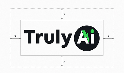
Clear Space
The minimum clear space around the Vedhaa’s Silks logo is defined as X, where X equals the width of the gold outer border of the peacock emblem multiplied by four.
A minimum distance of 1X should be maintained on every side of the complete logo lockup.
No text, graphics, images or other visual elements should enter this protected area.
For the case study, isolate the border-based measurement as a small gold rectangular unit marked X, then repeat the same unit around the outer edges of the logo to visually demonstrate the protected space.
Positioning Map
The traditional silk category often moves between two extremes: highly conventional heritage retailers and visually modern fashion brands that reduce cultural character in favour of minimalism.
Vedhaa’s Silks occupies a more expressive premium position. It preserves recognisable Indian cultural cues while giving them a polished, brand-led presence.
The opportunity sits where Heritage meets Expressive Luxury.
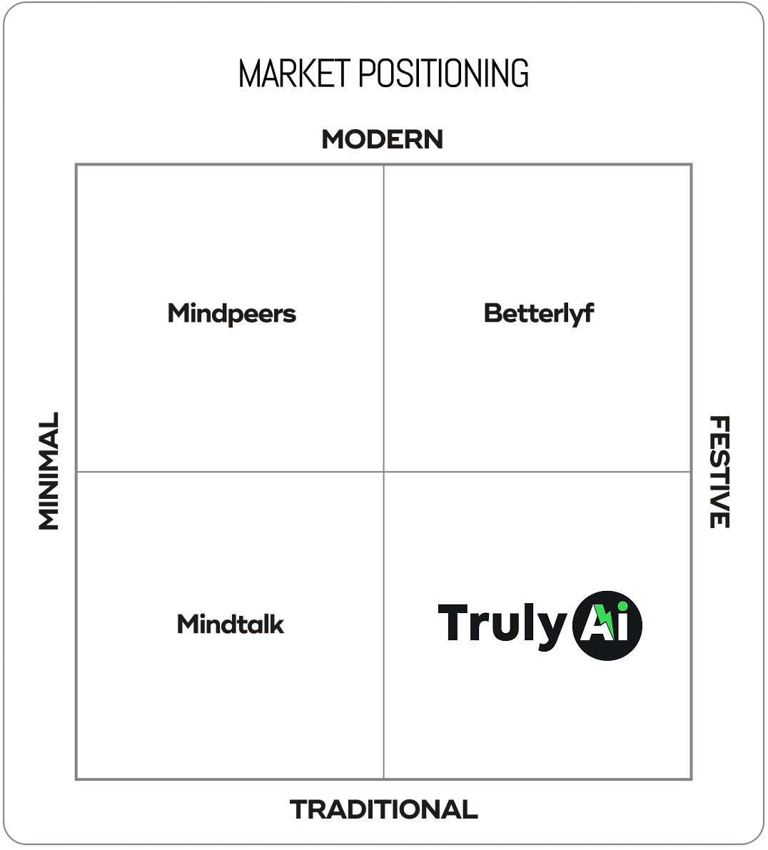
1. Grace becomes Movement
The brief asked for : A visual identity that could communicate the flowing elegance associated with silk.
The decision : The peacock's lower form was constructed using repeated sweeping curves that visually behave like layered folds of fabric.
Where you see it : The descending gold feather forms move outward and downward, creating the impression of a silk saree opening into a graceful drape.
2. Heritage becomes Prestige
The brief asked for : A traditional identity that felt elevated rather than visually old-fashioned.
The decision : Familiar cultural cues were paired with a controlled emblem structure, metallic gold treatment and high-contrast serif typography.
Where you see it : The peacock, deep ceremonial red and gold detailing establish heritage, while the refined rectangular frame gives the symbol a formal premium presence.
3. Beauty becomes Recognition
The brief asked for : A memorable brand symbol capable of becoming identifiable independently from the wordmark.
The decision : The peacock was simplified into one dominant silhouette with a distinctive curved neck and layered tail structure.
Where you see it : The negative space around the peacock's neck, the eye detail and the flowing feather construction create a recognisable visual signature.
4. Celebration becomes Colour
The brief asked for : A colour language that could express the emotional richness of traditional silk occasions.
The decision : A deep red and luminous gold palette was used to create immediate associations with ceremony, richness and festive elegance.
Where you see it : Red anchors the emblem and wordmark, while layered gold moves across the peacock, border and ornamental flourishes.
Concept Draw
The early concept process explored multiple interpretations of silk, movement and the peacock form through hand sketches and rapid structural studies. Initial directions investigated complete birds, abstract feather systems, fabric folds, traditional frames and monogram-led compositions.
Typography was explored alongside the symbol to understand how a formal serif structure could balance the organic movement of the peacock. Repeated iteration focused on proportion, neck curvature, feather rhythm, emblem dimensions and hierarchy between symbol and name.
The strongest direction emerged when the peacock's tail began to behave like draped silk. This visual connection created the most meaningful balance between product, culture and brand recognition and became the foundation for digital refinement.

From Sketch To Screen
The selected concept moved into digital refinement through careful simplification of the peacock silhouette and repeated adjustment of the feather curves.
The body-to-tail proportion was balanced to create a stronger vertical structure, while the emblem frame established consistent alignment. Typography was refined to complement the symbol without competing with its detail.
Scalability, readability and distinctiveness guided each adjustment, resulting in a mark that retains its character across both complete logo lockups and symbol-led applications.

The Symbol
The Vedhaa’s symbol begins with a peacock, but its story ends in silk.
The bird rises with a quiet, poised curve before its body opens into layers of flowing gold. These layers feel less like individual feathers and more like fabric falling into carefully arranged pleats. The transformation connects the natural grace of the peacock with the movement of a silk saree.
The rectangular red frame gives this movement a place of importance. It turns the bird into an emblem—something presented, remembered and repeated.
Strategically, the symbol brings product and emotion together. Silk is represented through flow. Celebration is carried through red. Premium character is expressed through gold.
Its distinctive silhouette allows the emblem to live independently on woven labels, boxes, seals, bags and digital icons, giving Vedhaa’s Silks a recognisable signature beyond the full wordmark.
.jpg)
Typography
Colors

A grounding neutral that intensifies the red and gold palette while creating a dramatic premium presentation environment.
The Vedhaa’s Silks palette is intentionally rich and ceremonial. Red creates emotional recognition, while layered gold tones capture the changing light and lustre of silk. Black provides contrast and visual depth. Together, the colours create an expressive premium system directly connected to the identity's traditional and occasion-led personality.
Real world Mock-ups
The identity should be tested where customers actually experience silk—from the first storefront impression to the final unboxing of a saree.
Real-world applications reveal whether the emblem maintains clarity at small scales, whether the gold treatment remains consistent across materials and whether the brand is recognisable across physical and digital touchpoints.
A consistent application system allows the peacock emblem to become a repeated signature, strengthening recognition at every stage of the customer journey.
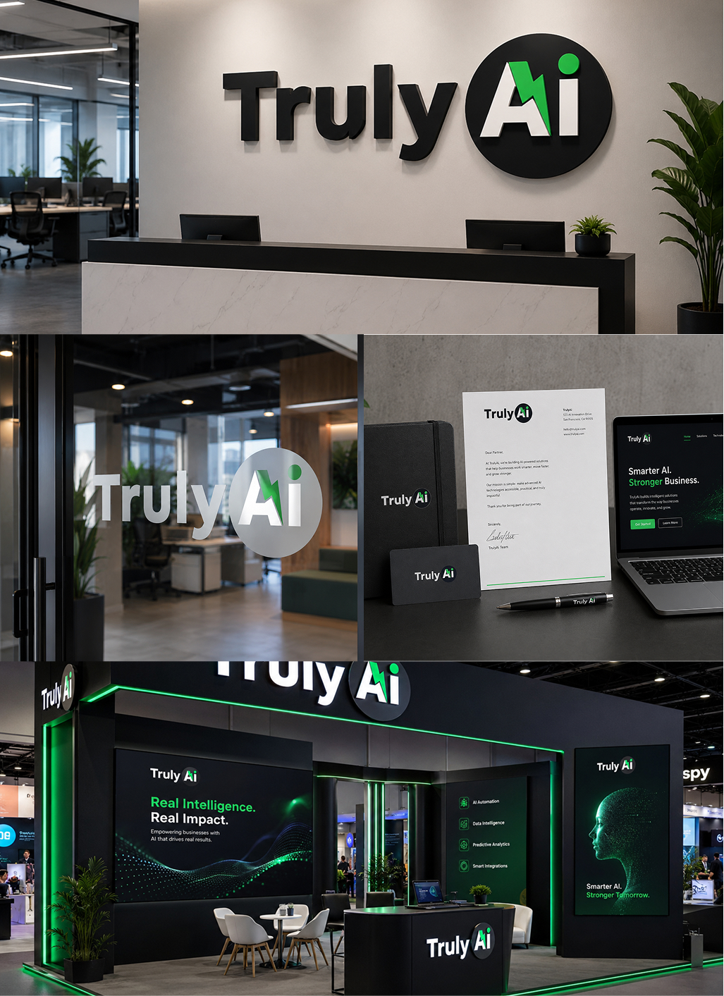
.jpg)

Turn ideas like this into your next project

Intro
Vedhaa’s Silks needed an identity capable of carrying the visual richness of silk without becoming ornamental for ornament's sake. In a category filled with traditional motifs, decorative typography and familiar cultural symbols, the challenge was to build a brand presence that felt rooted in heritage yet immediately ownable.
The identity needed to hold its elegance across saree packaging, textile labels, shopping bags, storefront communication and digital platforms. The central challenge was clear: translate the movement, prestige and ceremonial beauty associated with silk into a strong visual signature that customers could recognise before reading the name.
The result is a brand system where the peacock becomes more than decoration—it becomes the visual embodiment of silk itself.
Brand Brief
Personality
Regal, graceful, expressive, traditional, feminine and refined.
Vedhaa’s Silks carries the confidence of ceremonial luxury while remaining emotionally connected to the beauty of Indian textile culture.
Vision of the Business
To build a distinctive silk brand where every customer touchpoint celebrates the elegance, movement and cultural significance of traditional draping.
Target Audience
Women and families seeking silk sarees and traditional garments for weddings, celebrations, ceremonies and meaningful occasions.
The identity particularly speaks to customers who value cultural beauty, visual richness and a premium presentation experience.
USP
Silk elegance expressed through a distinctive peacock-led brand experience.
Logo Type
The identity combines a self-contained peacock emblem with an elegant serif wordmark. This structure gives Vedhaa’s Silks both visual recognition and name clarity.
The emblem can independently appear on labels, packaging seals and social media, while the complete lockup creates a formal and established retail presence.
Tagline
Grace in Every Drape
Key USPs
1. Occasion-Led Elegance
The brand is positioned around meaningful moments where silk becomes part of celebration, memory and personal expression.
2.A Distinctive Silk Signature
The peacock-inspired identity creates a recognisable visual language that separates Vedhaa’s Silks from conventional textile branding.
3.Tradition with Premium Presence
Cultural cues are presented through controlled composition, rich colour and refined detailing, giving traditional silk a more elevated brand experience.
The Vision
The creative vision was to make silk visible before it was touched.
The identity needed to communicate softness, movement and ceremonial grandeur while creating the confidence expected from a premium textile brand. Rather than illustrating a saree directly, the visual direction translates the natural flow of fabric into the layered feathers of a peacock.
Gold brings richness. Deep red brings celebration. The serif typography creates poise and heritage.
Every element works toward one central idea: to turn the grace of silk into a visual signature.

Usage Guide

Clear Space
The minimum clear space around the Vedhaa’s Silks logo is defined as X, where X equals the width of the gold outer border of the peacock emblem multiplied by four.
A minimum distance of 1X should be maintained on every side of the complete logo lockup.
No text, graphics, images or other visual elements should enter this protected area.
For the case study, isolate the border-based measurement as a small gold rectangular unit marked X, then repeat the same unit around the outer edges of the logo to visually demonstrate the protected space.
Positioning Map
The traditional silk category often moves between two extremes: highly conventional heritage retailers and visually modern fashion brands that reduce cultural character in favour of minimalism.
Vedhaa’s Silks occupies a more expressive premium position. It preserves recognisable Indian cultural cues while giving them a polished, brand-led presence.
The opportunity sits where Heritage meets Expressive Luxury.

1. Grace becomes Movement
The brief asked for : A visual identity that could communicate the flowing elegance associated with silk.
The decision : The peacock's lower form was constructed using repeated sweeping curves that visually behave like layered folds of fabric.
Where you see it : The descending gold feather forms move outward and downward, creating the impression of a silk saree opening into a graceful drape.
2. Heritage becomes Prestige
The brief asked for : A traditional identity that felt elevated rather than visually old-fashioned.
The decision : Familiar cultural cues were paired with a controlled emblem structure, metallic gold treatment and high-contrast serif typography.
Where you see it : The peacock, deep ceremonial red and gold detailing establish heritage, while the refined rectangular frame gives the symbol a formal premium presence.
3. Beauty becomes Recognition
The brief asked for : A memorable brand symbol capable of becoming identifiable independently from the wordmark.
The decision : The peacock was simplified into one dominant silhouette with a distinctive curved neck and layered tail structure.
Where you see it : The negative space around the peacock's neck, the eye detail and the flowing feather construction create a recognisable visual signature.
4. Celebration becomes Colour
The brief asked for : A colour language that could express the emotional richness of traditional silk occasions.
The decision : A deep red and luminous gold palette was used to create immediate associations with ceremony, richness and festive elegance.
Where you see it : Red anchors the emblem and wordmark, while layered gold moves across the peacock, border and ornamental flourishes.
Concept Draw
The early concept process explored multiple interpretations of silk, movement and the peacock form through hand sketches and rapid structural studies. Initial directions investigated complete birds, abstract feather systems, fabric folds, traditional frames and monogram-led compositions.
Typography was explored alongside the symbol to understand how a formal serif structure could balance the organic movement of the peacock. Repeated iteration focused on proportion, neck curvature, feather rhythm, emblem dimensions and hierarchy between symbol and name.
The strongest direction emerged when the peacock's tail began to behave like draped silk. This visual connection created the most meaningful balance between product, culture and brand recognition and became the foundation for digital refinement.

From Sketch To Screen
The selected concept moved into digital refinement through careful simplification of the peacock silhouette and repeated adjustment of the feather curves.
The body-to-tail proportion was balanced to create a stronger vertical structure, while the emblem frame established consistent alignment. Typography was refined to complement the symbol without competing with its detail.
Scalability, readability and distinctiveness guided each adjustment, resulting in a mark that retains its character across both complete logo lockups and symbol-led applications.

The Symbol
The Vedhaa’s symbol begins with a peacock, but its story ends in silk.
The bird rises with a quiet, poised curve before its body opens into layers of flowing gold. These layers feel less like individual feathers and more like fabric falling into carefully arranged pleats. The transformation connects the natural grace of the peacock with the movement of a silk saree.
The rectangular red frame gives this movement a place of importance. It turns the bird into an emblem—something presented, remembered and repeated.
Strategically, the symbol brings product and emotion together. Silk is represented through flow. Celebration is carried through red. Premium character is expressed through gold.
Its distinctive silhouette allows the emblem to live independently on woven labels, boxes, seals, bags and digital icons, giving Vedhaa’s Silks a recognisable signature beyond the full wordmark.

Typography
Colors

A grounding neutral that intensifies the red and gold palette while creating a dramatic premium presentation environment.
The Vedhaa’s Silks palette is intentionally rich and ceremonial. Red creates emotional recognition, while layered gold tones capture the changing light and lustre of silk. Black provides contrast and visual depth. Together, the colours create an expressive premium system directly connected to the identity's traditional and occasion-led personality.
Real world Mock-ups
The identity should be tested where customers actually experience silk—from the first storefront impression to the final unboxing of a saree.
Real-world applications reveal whether the emblem maintains clarity at small scales, whether the gold treatment remains consistent across materials and whether the brand is recognisable across physical and digital touchpoints.
A consistent application system allows the peacock emblem to become a repeated signature, strengthening recognition at every stage of the customer journey.


Turn ideas like this into your next project
.png)
About Product and Project
Meaning was never the problem. Durability was.
This audience already knows what Code 4 means. Nobody needed convincing the symbol matters. What the listing had to prove was that the decal is built well enough to earn a place on a patrol car, a locker, a duty bag. That's a materials argument, not an emotional one. The emotion was already in the room.
Turning a Tribute Symbol into a Trusted, Buy-Worthy Decal
The Code 4 listing needed to translate an emotional tribute — "behind every badge is a person" — into a product shoppers trust enough to actually buy. The redesign paired proof of durability (waterproof, UV, fade-resistant, tested across squad cars, gear, and rough surfaces) with the emotional core of the brand (family, service, community), moving buyers from "this represents something I care about" to "this is well-made enough to put on my gear" within the first few images.
Buyers Pain
Competitor teardown
We analyzed Follicle Booster, Rogue River Tactical, Anley, Decals by Haley, and Generic the brands holding the most visible positions in this category. Their ratings range from 3.5 to 4.0 stars, which looks pretty solid at first. But once you dig into how those ratings are distributed, the picture starts to change.
30% of all reviews across the five leading competitors sit at three stars or below - 7,518 of 24,750. Not one of them is under 27%
.png)
Competitor review Summary
Brand Personality

Amazon Lisiting Image
%201.png)
Turn ideas like this into your next project
.png)
About Product and Project
A precision pen and a blending brush.
A precise multi-prong tip creates natural, hair-like strokes to fill sparse patches and define your beard, moustache, cheek and neckline with easy, controlled application. Sweat- and smudge-resistant yet washes cleanly with soap and water, with a blending brush for a seamless finish.
No listing to fix. A category to learn.
Beard Butler came to us pre-launch. There was no existing Amazon listing to audit, no sales history to read, no search-term report to mine. The product was ready;
Buyers Pain
Competitor teardown
We analyzed Follicle Booster, Viking Revolution, MISICH, Pacinos, and Striking Viking — the brands holding the most visible positions in this category. Their ratings range from 3.5 to 4.0 stars, which looks pretty solid at first. But once you dig into how those ratings are distributed, the picture starts to change.
30% of all reviews across the five leading competitors sit at three stars or below - 7,518 of 24,750. Not one of them is under 27%
Competitor review Summary
Brand Personality

Design concept delivered:
Final Amazon Lisiting Image
.png)

Turn ideas like this into your next project
.png)
About Product and Project
Korea's Favorite Comfort Soup, Ready in Minutes
OMA Nourishing Seaweed Soup brings the taste of a traditional Korean grandmother's kitchen into a convenient, on-the-go sachet. Made with real seaweed and 100% vegan ingredients, this high-fiber soup is gentle on digestion and rich in flavor — nothing like a thin, watery instant mix. Simply add hot water and stir for a warm, nourishing bowl in under 2 minutes, whether you're on a flight, at your desk, or around a campfire. Loved by thousands for its authentic taste and comforting simplicity, OMA turns any moment into a moment of homemade comfort.
Turning an Unfamiliar Comfort Food into an Easy Add-to-Cart
OMA's seaweed soup needed a listing that could make an unfamiliar Korean comfort food feel instantly appealing to a broad Amazon audience. The redesign paired appetite appeal with fast functional clarity — sachet format, 2-minute prep, vegan and high-fiber claims — then closed with lifestyle and cultural-trust shots to move shoppers from curiosity to purchase.
Buyers Pain
.png)
Competitor teardown
We analyzed Follicle Booster, Sewak Al Falah, Zenia, Sewak Al Noor, and Freegrin the brands holding the most visible positions in this category. Their ratings range from 3.5 to 4.0 stars, which looks pretty solid at first. But once you dig into how those ratings are distributed, the picture starts to change.
30% of all reviews across the five leading competitors sit at three stars or below - 7,518 of 24,750. Not one of them is under 27%

Competitor review Summary
Brand Personality

Design concept delivered:
Amazon Lisiting Image
.png)

Turn ideas like this into your next project
.png)
About Product and Project
Real seaweed, not powder.
Most instant soup is a flavour sachet and hot water. This one has actual seaweed in the packet, and that had to be visible before anything else on the page. The rest of the stack follows from it. What's inside, what it looks like in the bowl, and how little you do to get there.
Turning an Unfamiliar Comfort Food into an Easy Add-to-Cart
OMA's seaweed soup needed a listing that could make an unfamiliar Korean comfort food feel instantly appealing to a broad Amazon audience. The redesign paired appetite appeal with fast functional clarity — sachet format, 2-minute prep, vegan and high-fiber claims — then closed with lifestyle and cultural-trust shots to move shoppers from curiosity to purchase.
Buyers Pain
Competitor teardown
We analyzed Follicle Booster, Kikkoman, Chung Jung One, Marukome, and Benepisyo the brands holding the most visible positions in this category. Their ratings range from 3.5 to 4.0 stars, which looks pretty solid at first. But once you dig into how those ratings are distributed, the picture starts to change.
30% of all reviews across the five leading competitors sit at three stars or below - 7,518 of 24,750. Not one of them is under 27%

Competitor review Summary
.png)
Brand Personality

Amazon Lisiting Image


Turn ideas like this into your next project
.png)
About Product and Project
Cute gets the click. It doesn't close the sale.
The product was already likeable. The listing never answered the four things people actually stall on: how big the stickers really are, how many you get, where they can go, and whether they hold up outside. Those four questions run through every low review in this category. The image stack was built to answer them in order.
Turning a playful decal into a complete Amazon story.
The goal of this project was to transform a simple 4-piece cat sticker pack into a clear, engaging, and conversion-focused Amazon listing. The existing product needed stronger communication around its different sticker designs, sizing, everyday applications, durability, and the unique “peeking cat” concept.
Buyers Pain
.png)
Competitor teardown
We pulled the four packs holding the most visible positions in this search: Winston & Bear Store, BulbaCraft, Fsforcar and Bozentim Store . Star averages run 3.5 to 4.5 which reads healthy at a glance. Read the low reviews and it's the same two complaints, four times over. It came smaller than expected. It didn't last outside.
30% of all reviews across the five leading competitors sit at three stars or below - 7,518 of 24,750. Not one of them is under 27%

Competitor review Summary
.png)
Brand Personality

Design concept delivered:
.png)
Final Amazon Lisiting Image
%201.png)


Turn ideas like this into your next project
.png)
About Product and Project
A Seed Today. A Garden Favourite Tomorrow.
Nobody hesitates over the price of a seed packet. They hesitate because they won't know if it worked for three weeks, and by then the planting window has closed. This listing had to earn trust before a single seed went in the ground. That's why planting depth, spacing, timing and grower provenance sit high in the stack instead of buried at the bottom.
Turning a Seed Packet Into a Growing Story
The new listing was structured as a visual journey from seed → planting → growing → garden use → plant characteristics → long-term potential. Clean botanical imagery, fresh greens, natural garden photography, instructional graphics, and consistent product presentation work together to make the information approachable while reinforcing the heritage, perennial, and garden-focused positioning of the product.
Buyers Pain
Competitor teardown
We pulled the [four] seed brands holding the most visible positions on this search: [Seeds Needs, Healthy Embassy, Kviter]. Star averages run [3.5] to [4.5], which reads healthy at a glance. Read the low reviews and they are almost all the same review. It didn't come up.
30% of all reviews across the five leading competitors sit at three stars or below - 7,518 of 24,750. Not one of them is under 27%

Competitor review Summary

Brand Personality

Design concept delivered:
Amazon Lisiting Image
%201%20(2).png)

.webp)
.webp)
.jpg)


.webp)

.webp)
.webp)


.webp)
-p-500.webp)
-p-500.webp)


.webp)



.webp)
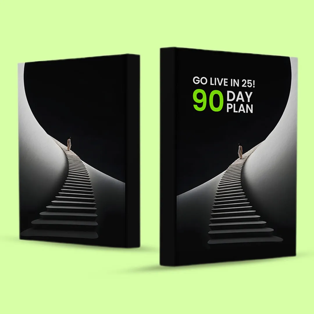


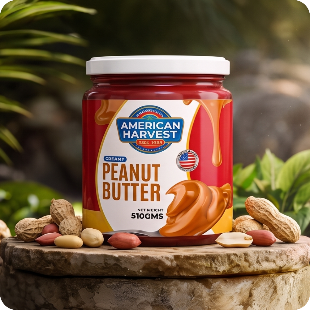


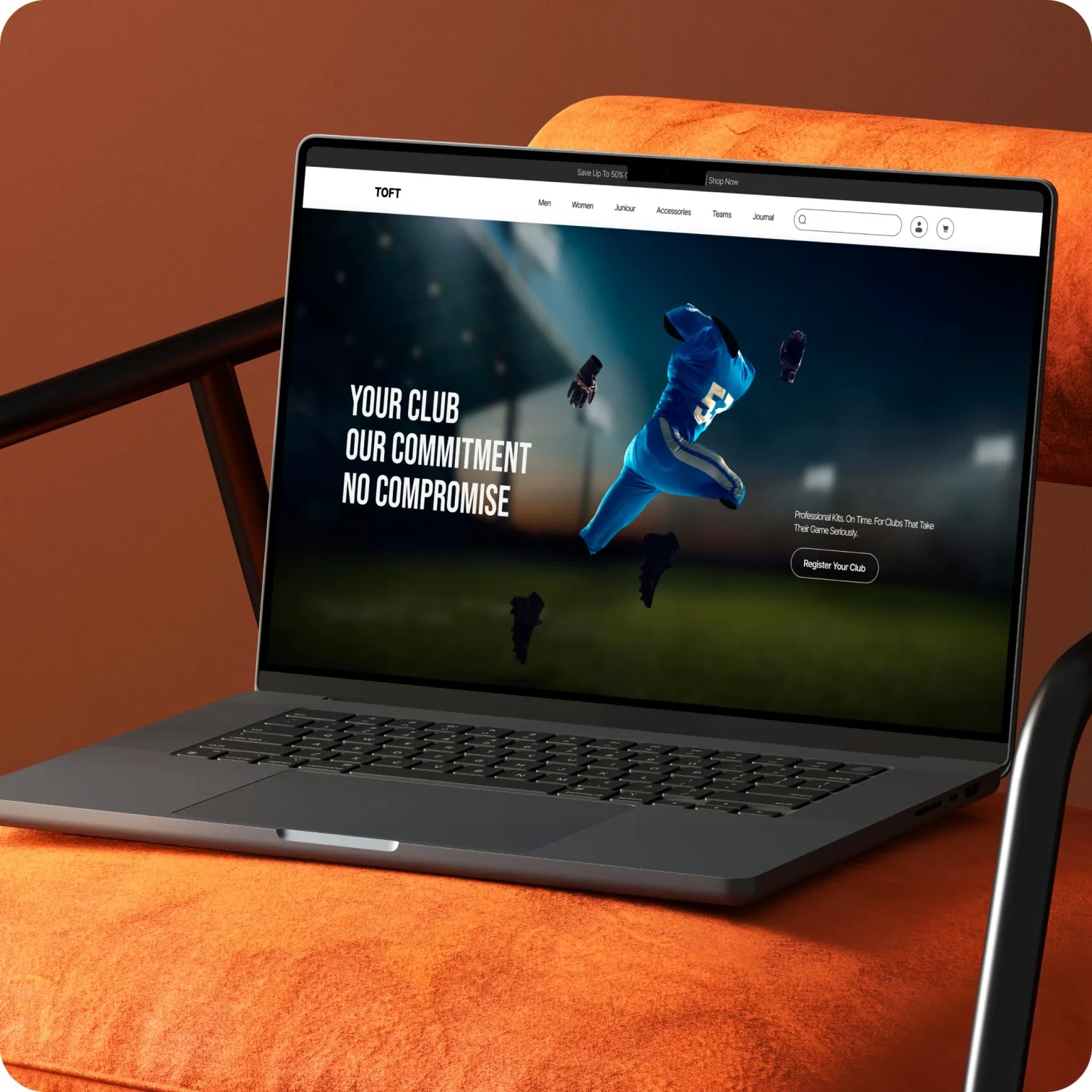
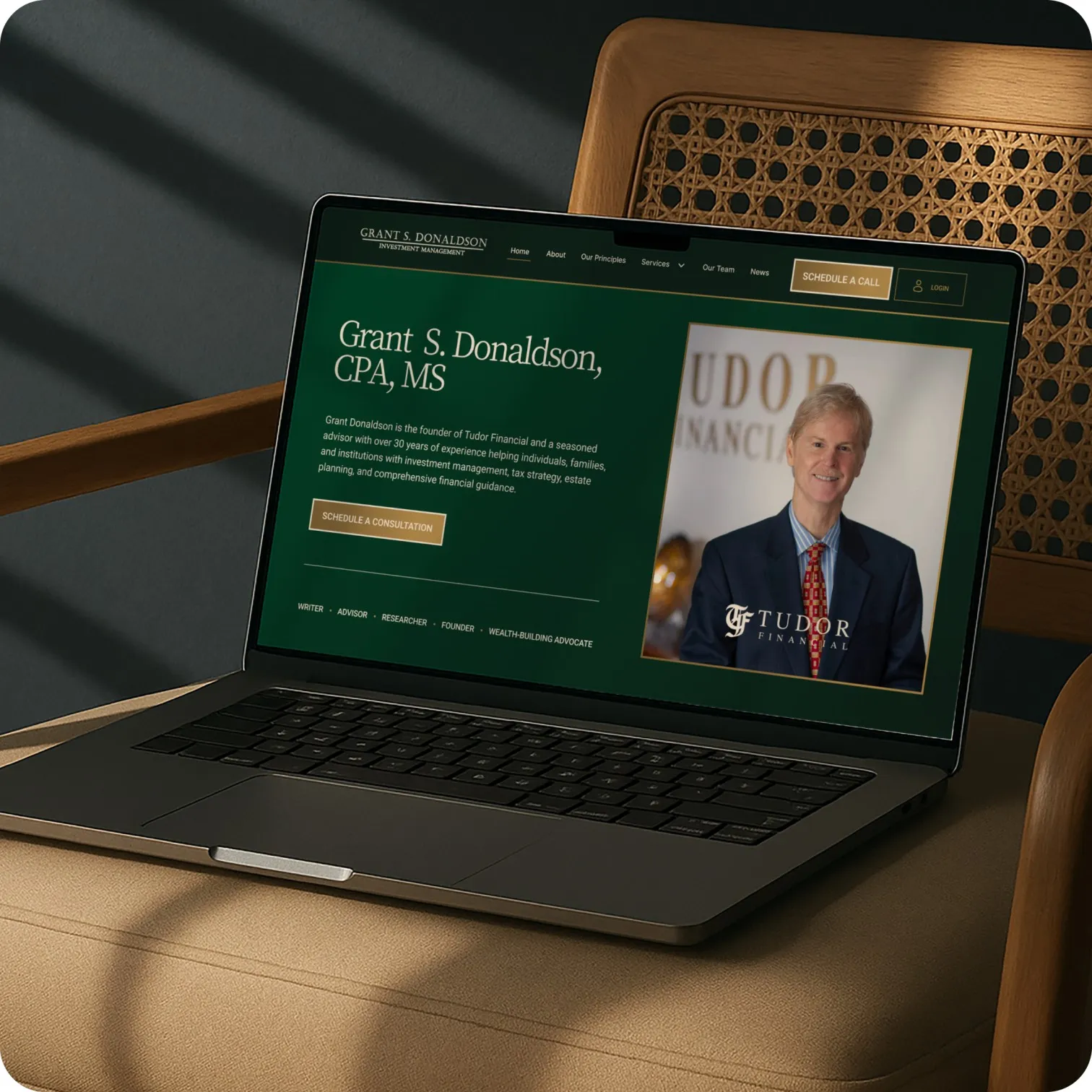
.webp)


.svg)


.webp)
.webp)
.webp)
.webp)
.webp)



%20(1).webp)


.webp)


.webp)


.webp)


.webp)
.webp)


.jpg)
.webp)
.webp)
.webp)